CROSSROADS
When unexpected costs ate our budget (read about it in this post), we had to decide whether or not to press on with the Addition. It’s always a tough call: nobody enjoys sinking all their $ into invisible safety code fixes. Sure the improved layout would increase functionality, but the house might still feel like a receptacle for our stuff unless we added more SQ FT while drastically reducing and re-organizing our stuff. But why put ourselves through such extreme upheaval without a magic payoff? We needed to honor our intention to create personal space for US AS HUMANS to flourish, and that would mean elongating the timeline while we harvested more $ wherever we could find it. The Addition + Mudroom was a go.
Initial drawings showed more over-the-top extravagance: a dramatic folding window wall for indoor/outdoor living, 3 tall vertical picture windows, a ‘live’ roof, plumbing in the mudroom, etc. We pulled back on all those extras to achieve what we could with less $.
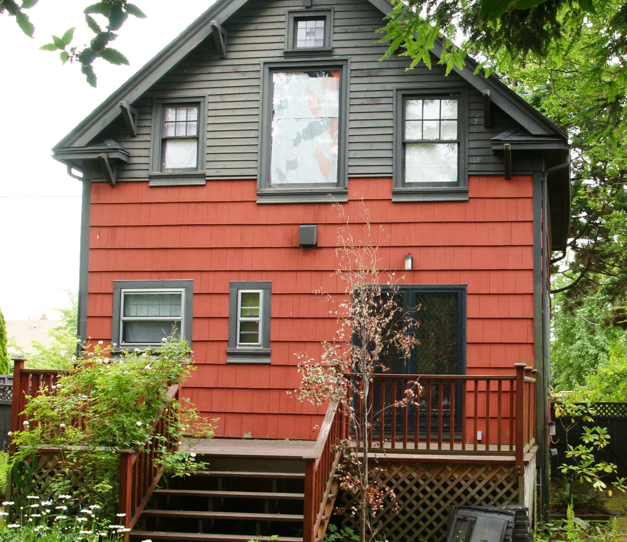
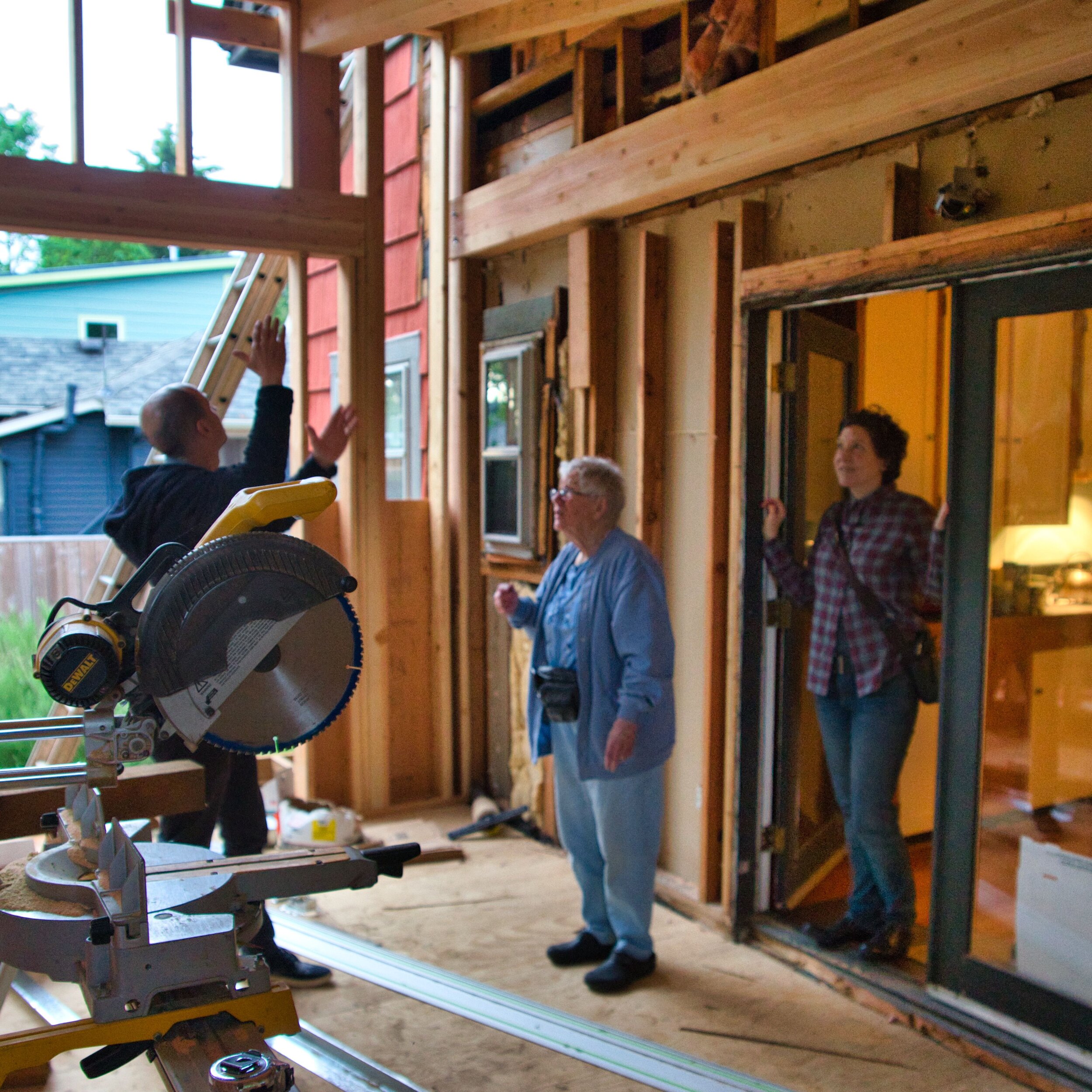


From the outside, the Addition is a big metal lego chunk clamped onto our trad bungalow. It’s not really visible from the front of our house, but about 5 neighbors behind/adjacent have an awesome view of it. The deck is low maintenance TREX that wraps around the north and west sides of the house. Our yard is still huge (we are lucky to have a 5000 SQ FT lot) and dominated by enormous trees that seem to have their own ecosystem and clean our air. Old Colonel Gay supposedly planted his Christmas trees back there. Giant California Redwood. Cool Blue Spruce. They protect us, but also block any gardening possibilities. Landscaping is a 2020 project put off indefinitely due to the COVID lockdown. But I digress.
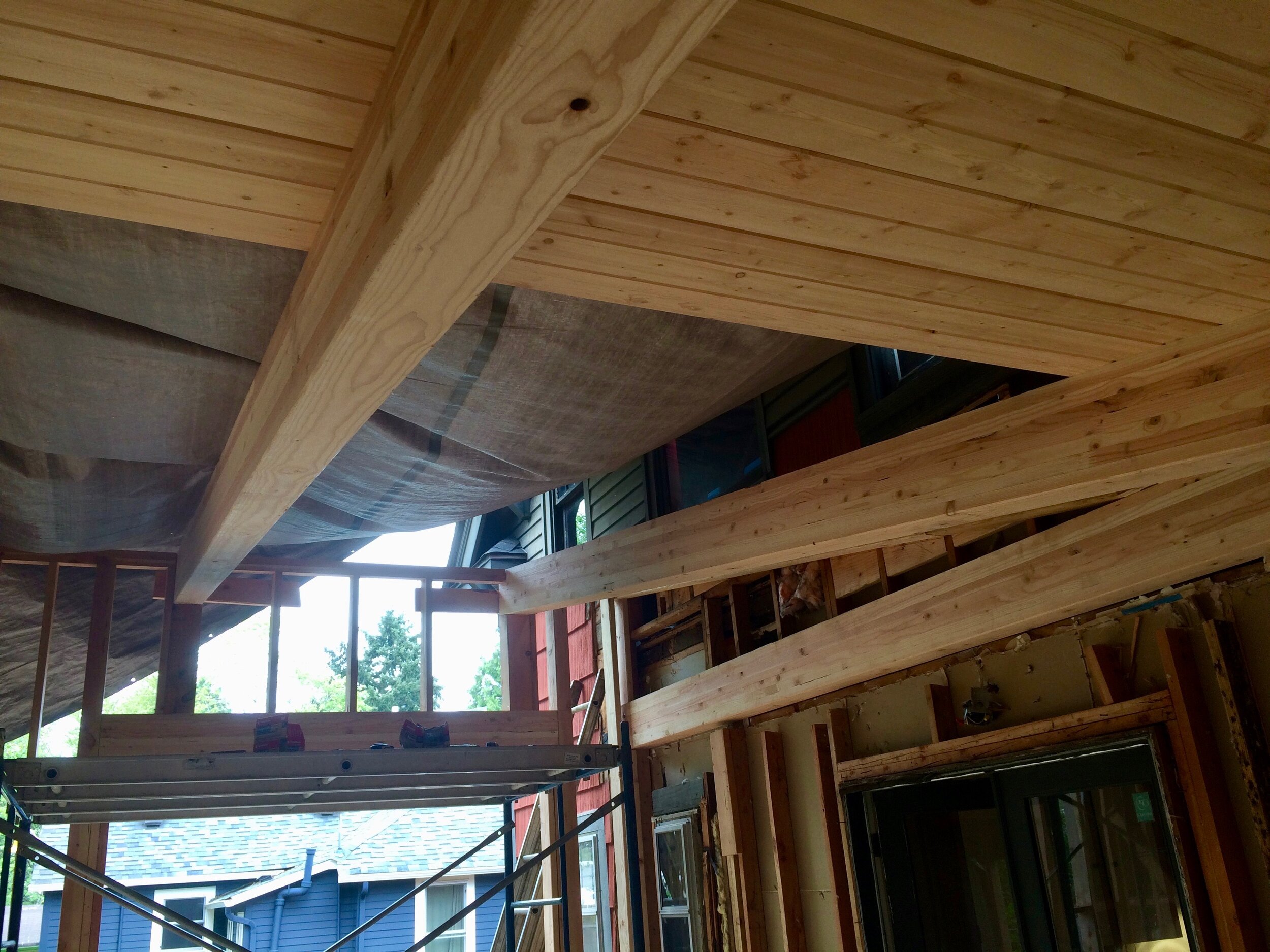
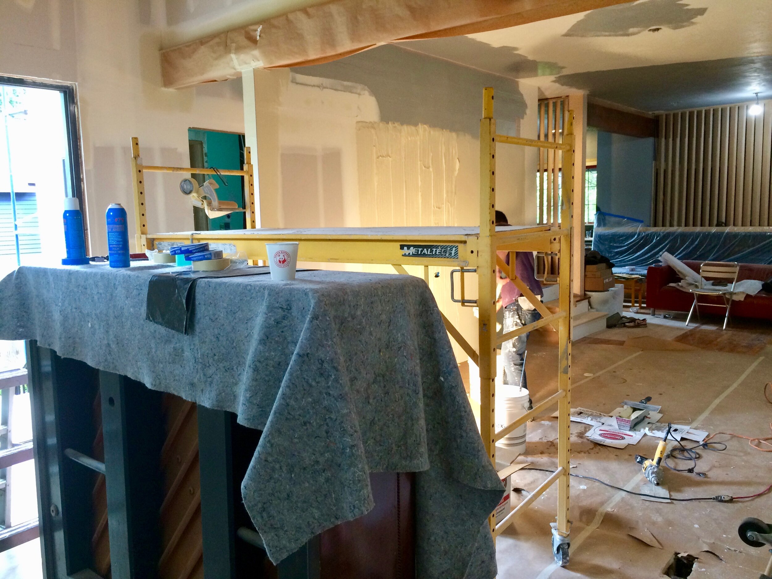
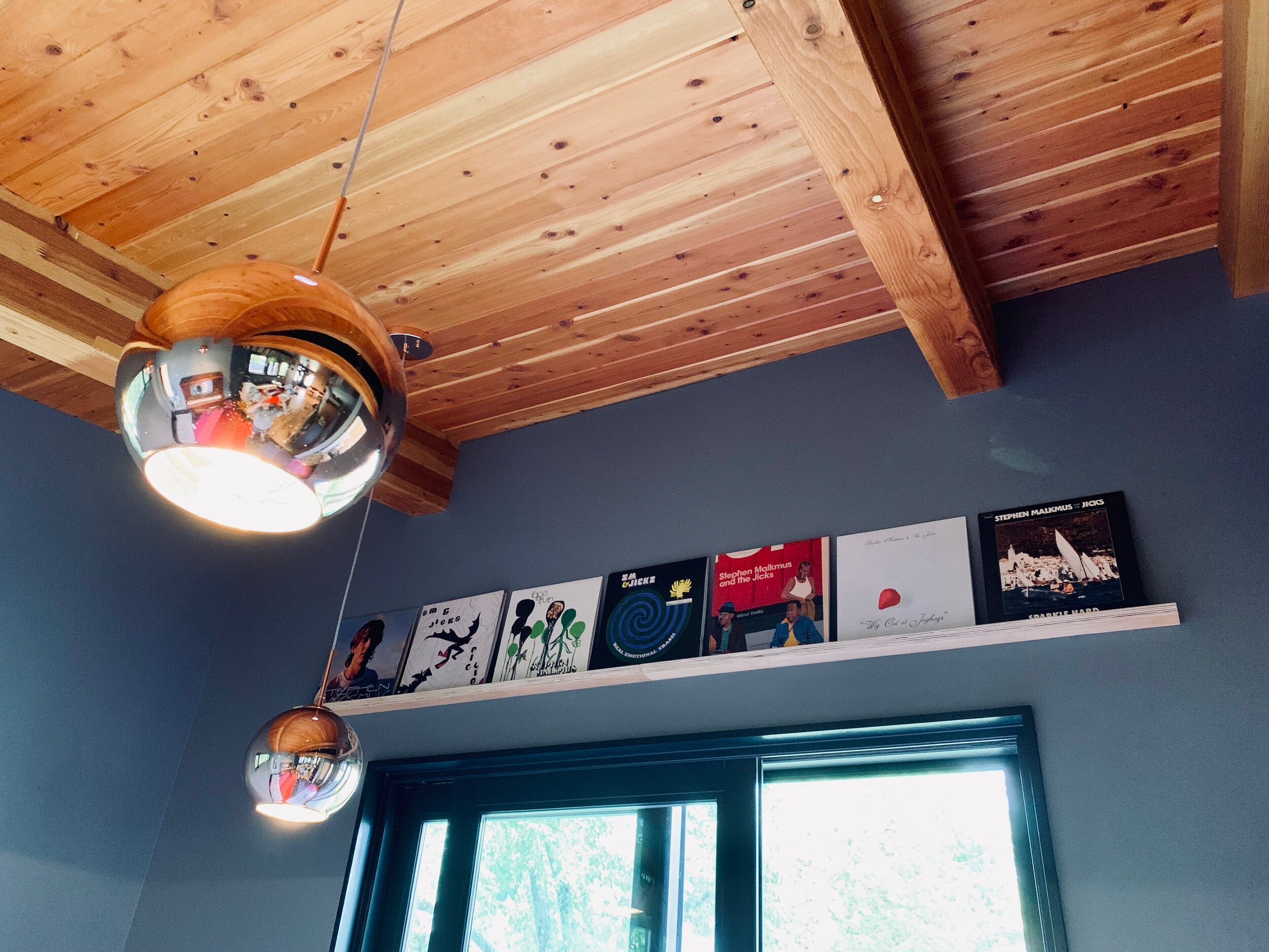
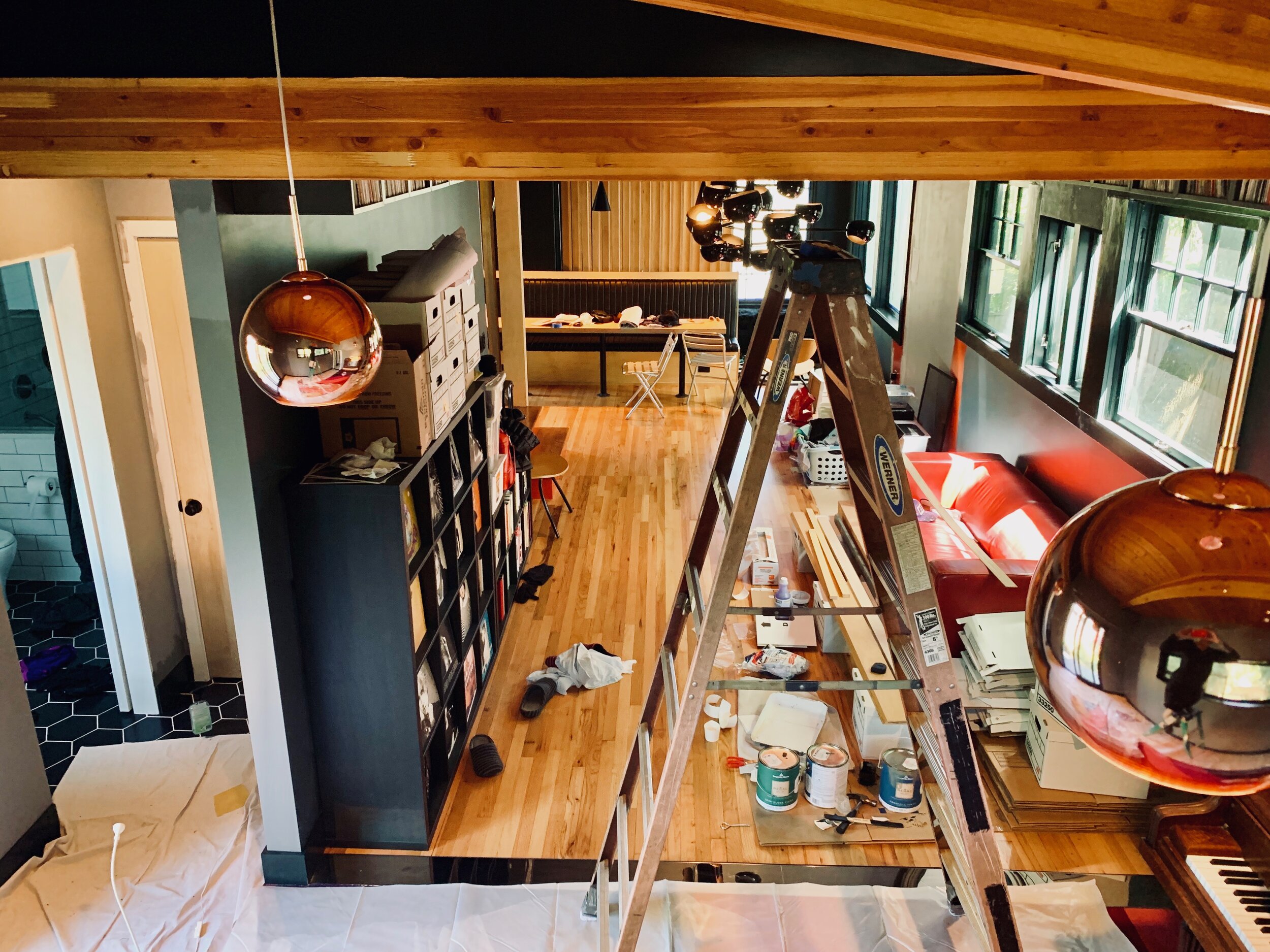
The Addition ceiling is clad with cool tongue + groove CAR DECKING. We extended the look to the outside overhang for continuity. Angles! The pitch climbs from 9’ to 13’ inside. We couldn’t afford that impractical wall-of-glass, but the extra tall sliding doors we did select accentuate that height. The deck wraps around to the mudroom door…the idea is to be able to hang our sweaty post-exercise gunk in there and make a beeline to the shower. Besides the carpet (detailed in the last post), the other fixed feature of the Addition is my family piano that I learned on, my mom learned on, her mom learned on, etc. It finally gets proper breathing room. It has a few ‘birds’ and needs to be rebuilt inside, but we love its ancient dust and will probably let it be. It’s a living antique thing sitting on a super mod carpet. We’ve mounted a flat screen above it for future old-timey piano jam sing-alongs (lyrics on the screen) and, you know, ZUMBA!
Many finishing details remain for the Addition…we’ll add art, mount guitars and speakers, build the mobile DJ station etc. What IS finished is the…
SUPERFUZZ BIG MUDROOM
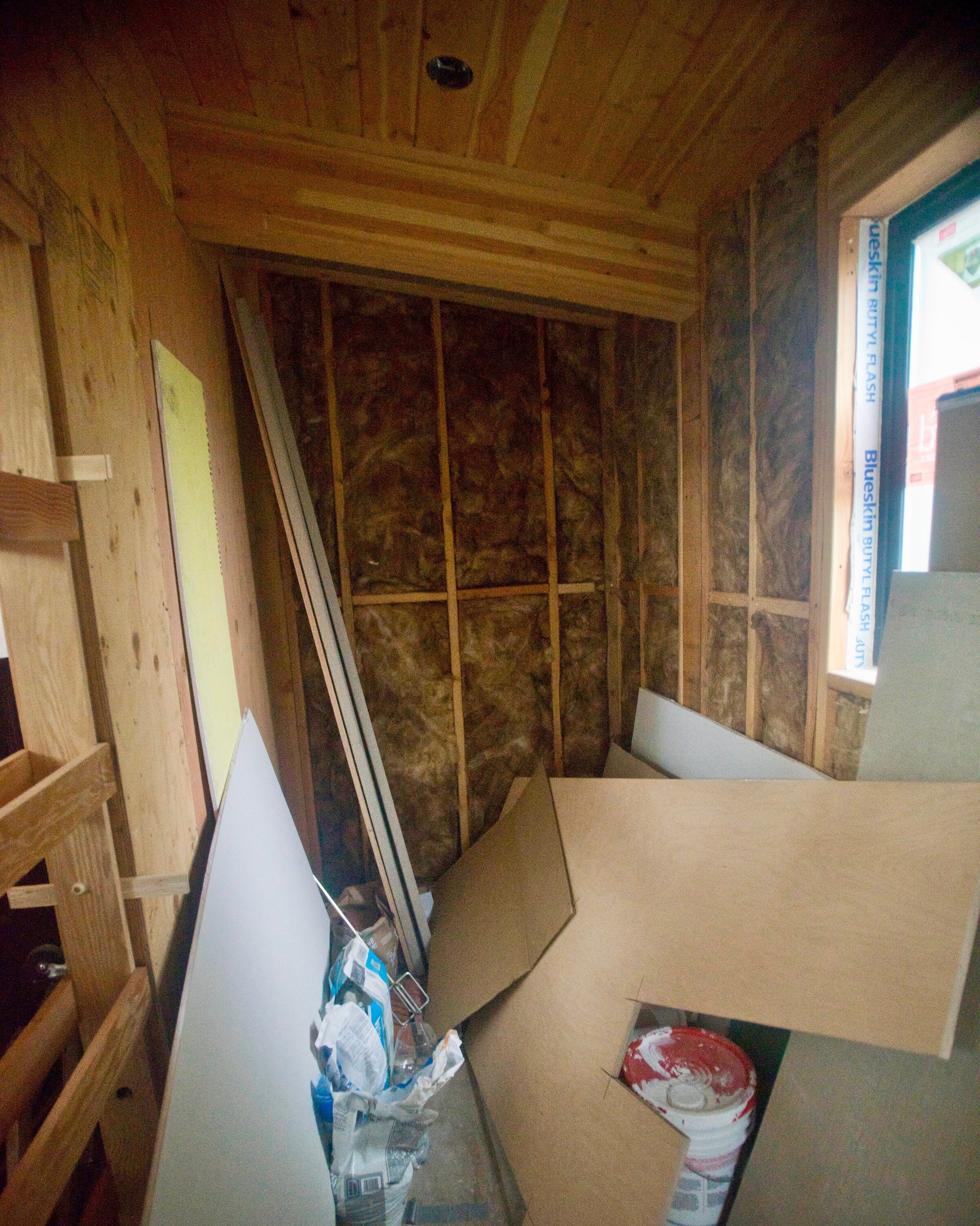


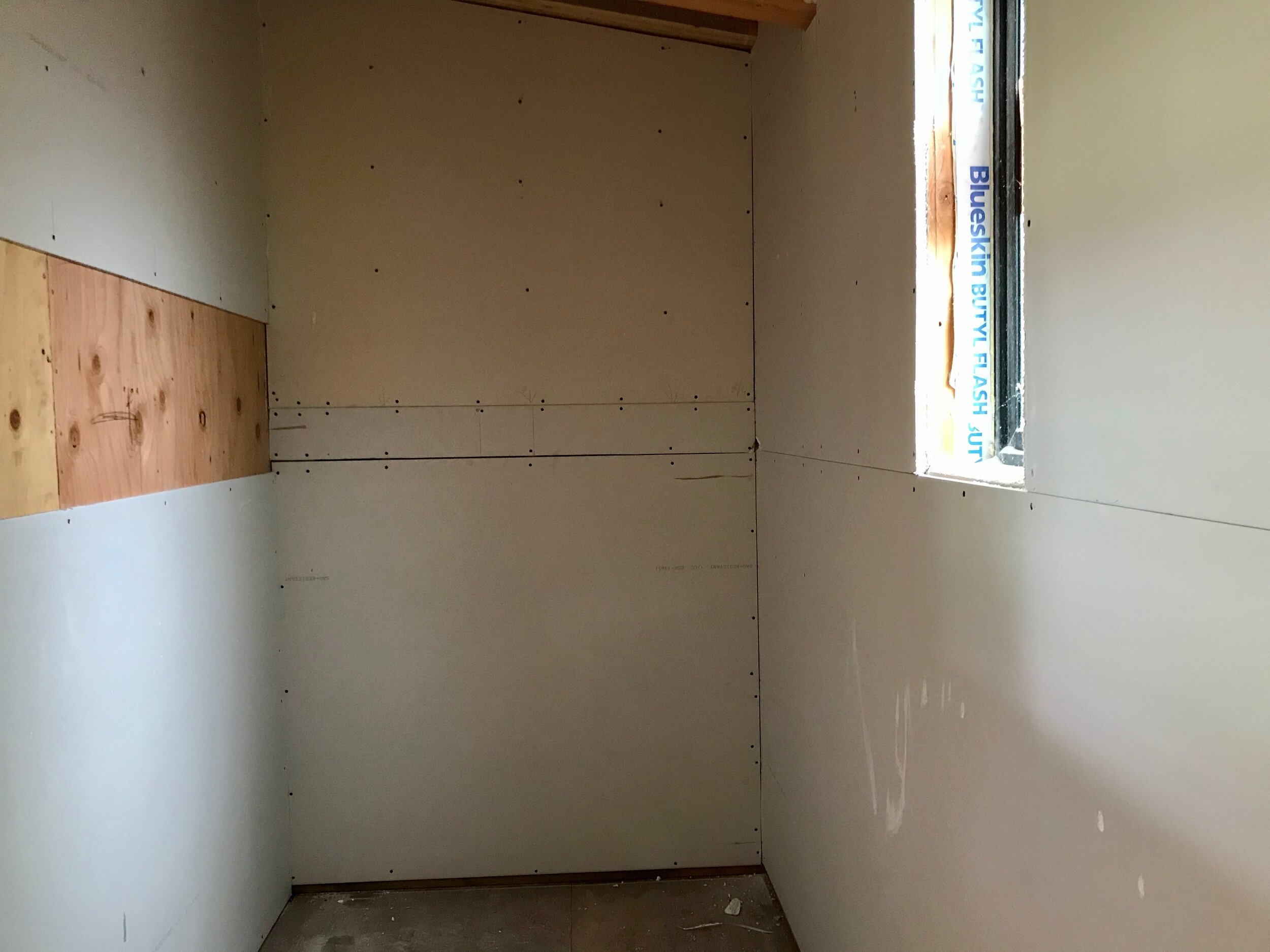
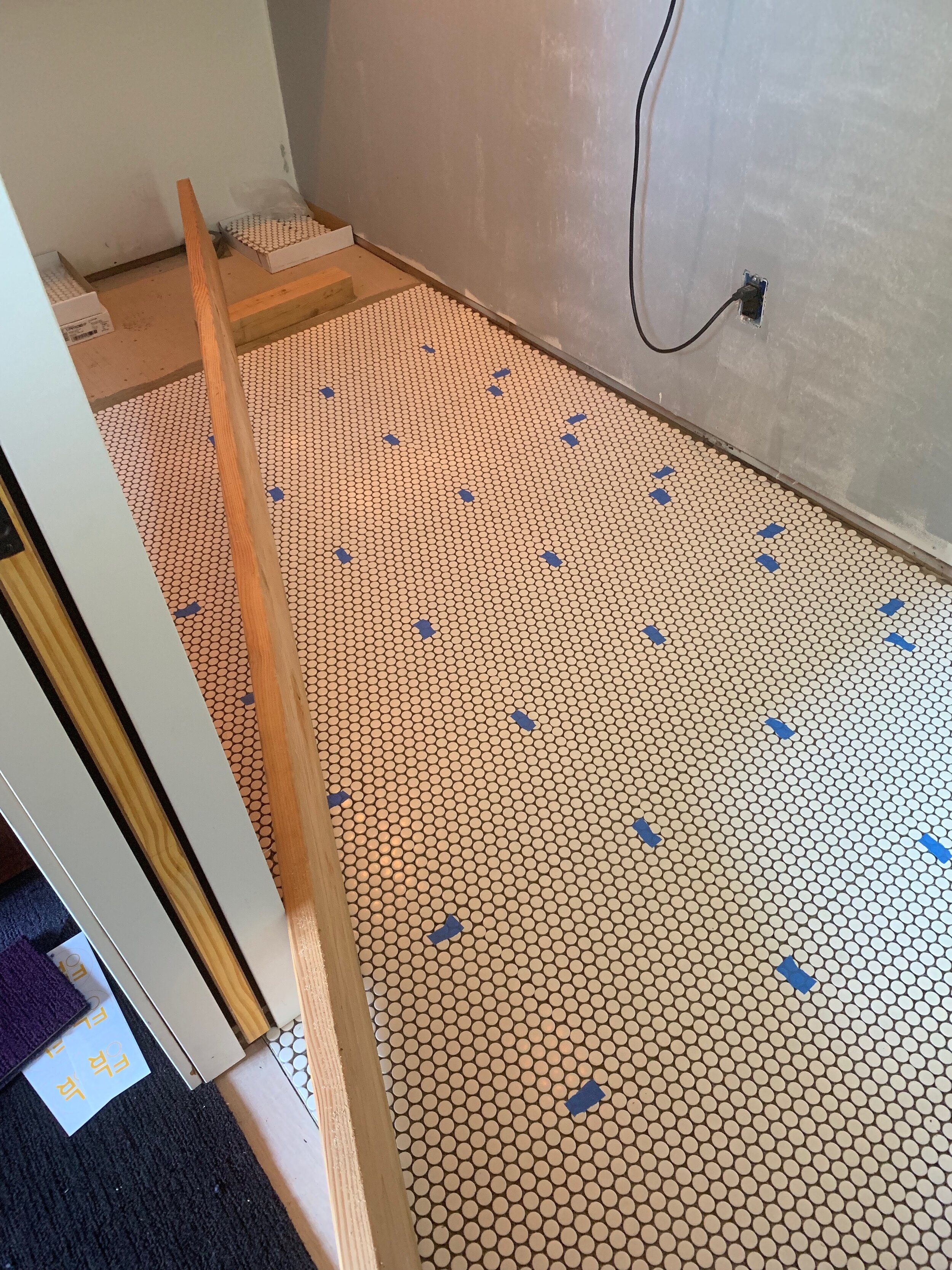
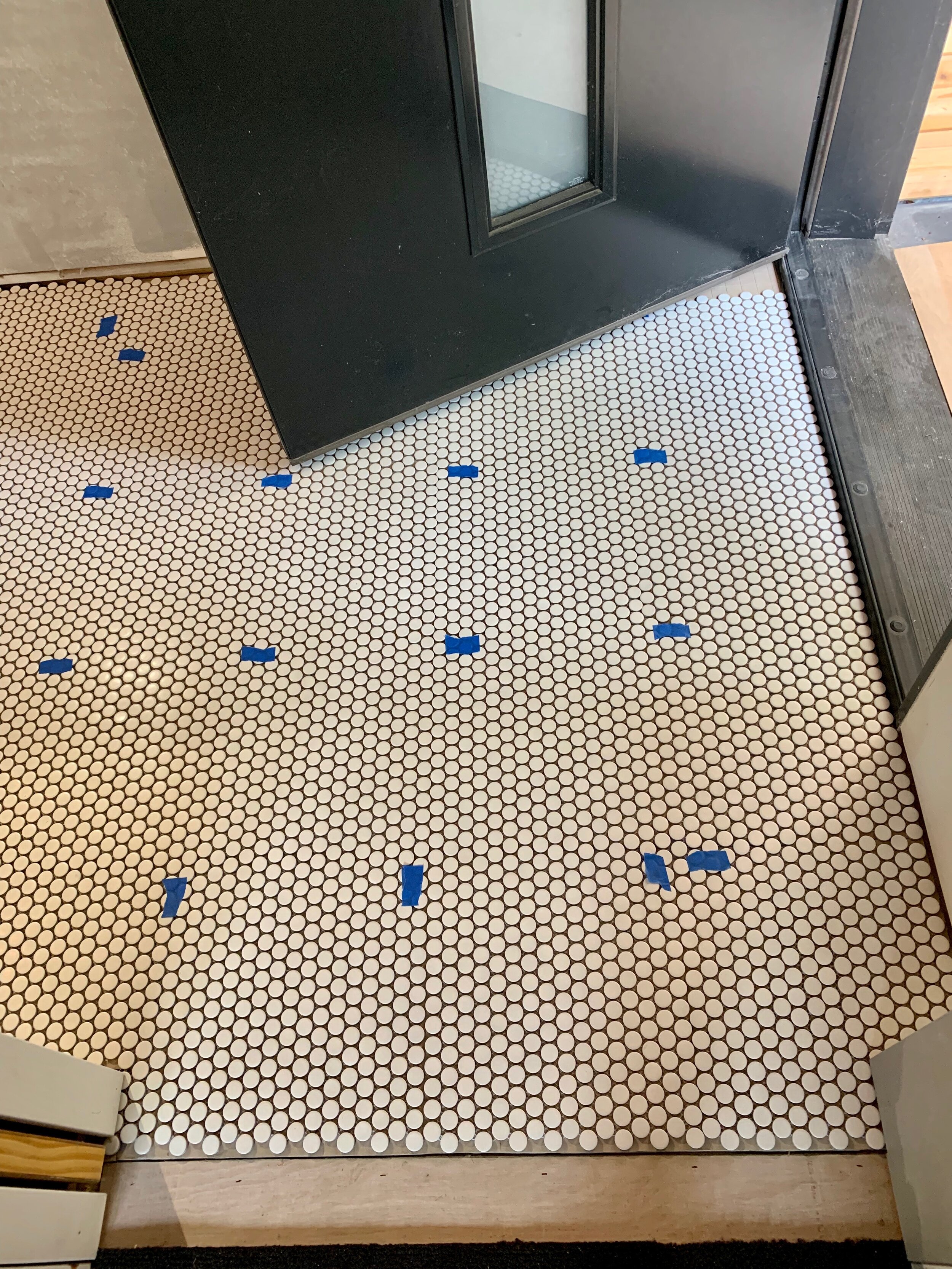
STYLE INSPO:
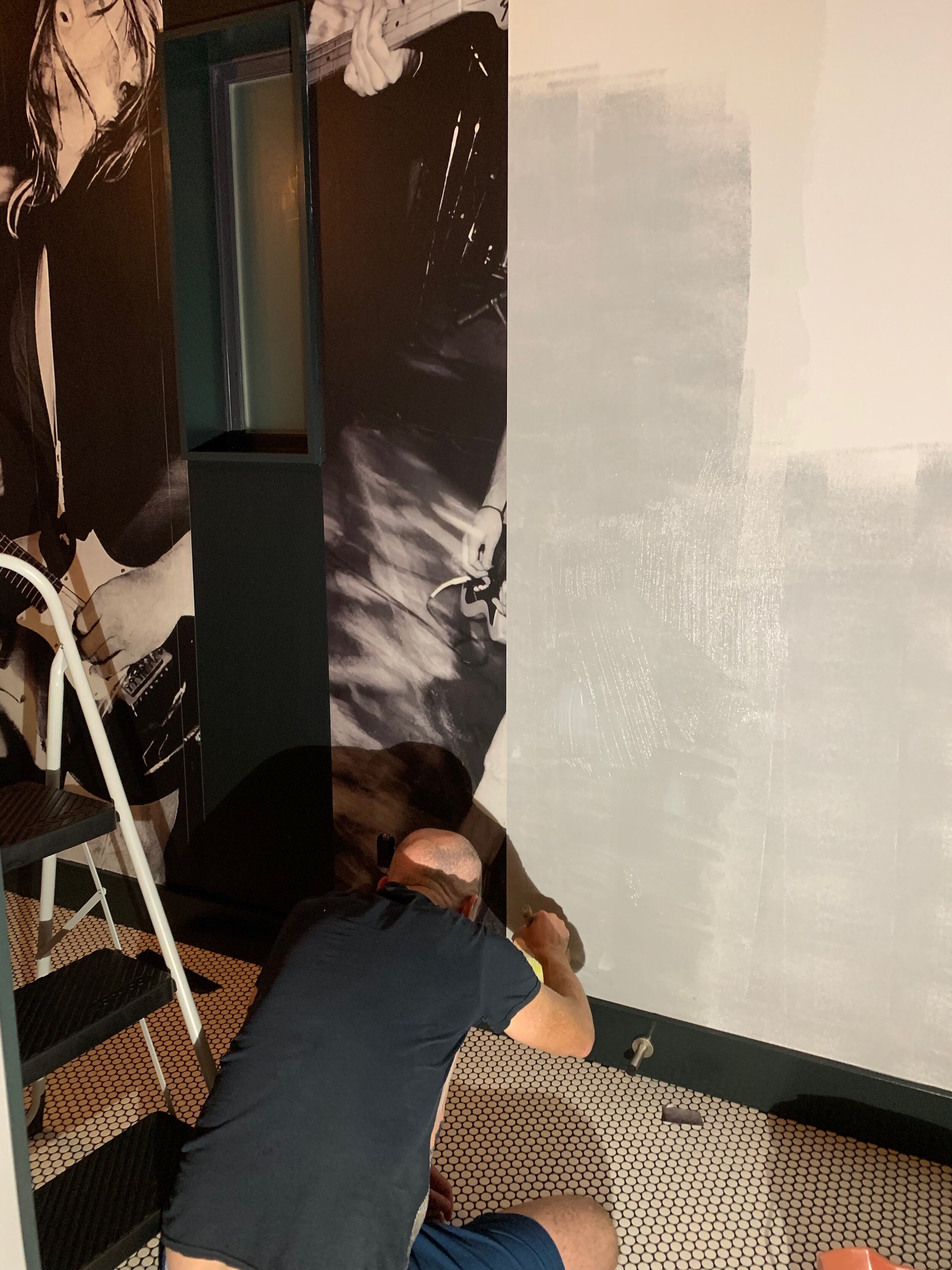
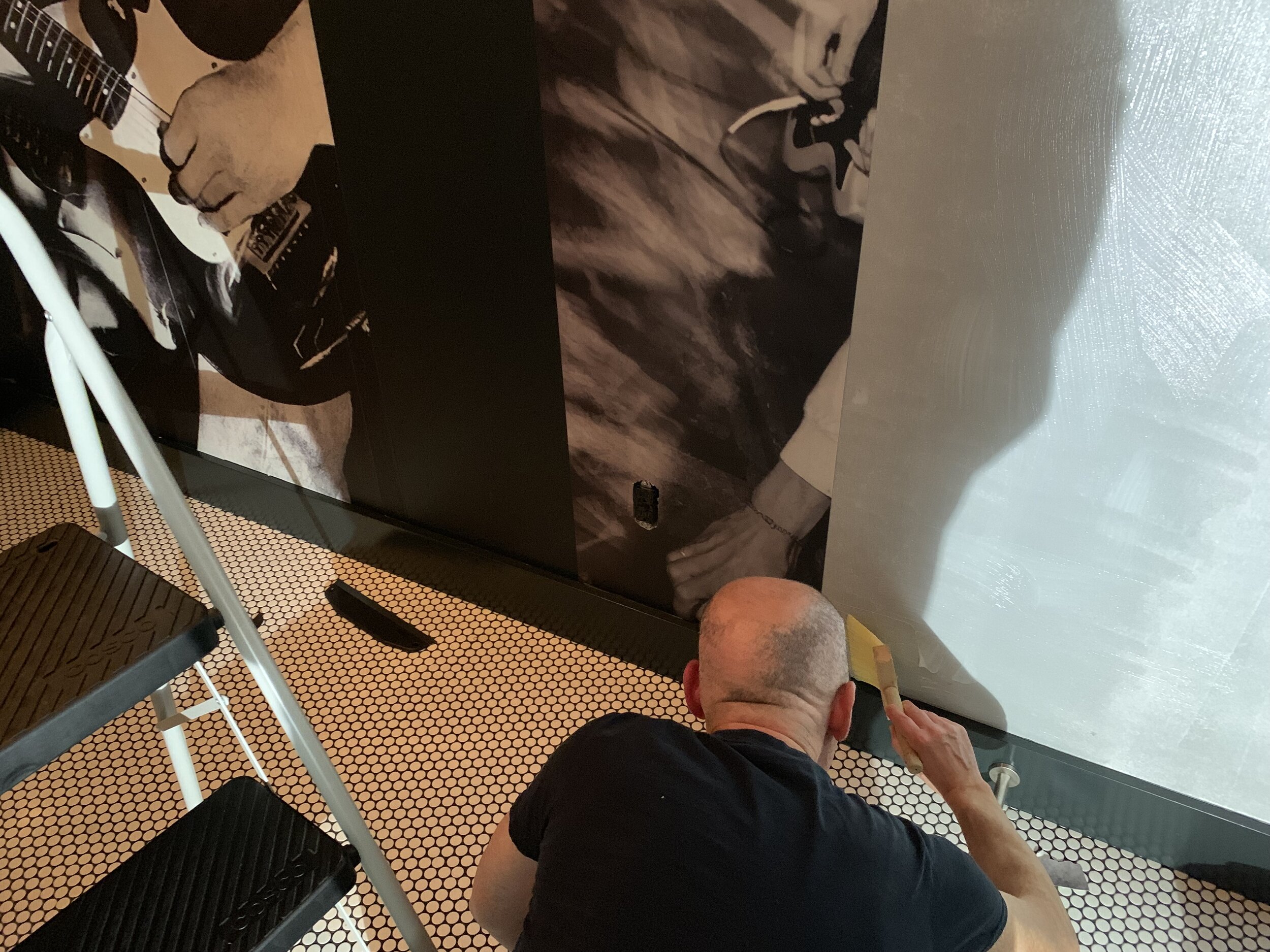
Mike and I are grunge lifers. We grew up going to the same shows in Seattle and met in college. On my first day there, I spied him wearing a MUDHONEY tee shirt and ran to introduce myself as a kindred spirit. Decades later, I decided our MUDROOM would go grunge, another wack idea I had while Mike was on tour. With SUB-POP circa ‘89 as my inspo, I combed all Chaz Petersen’s black and white pics of our fave bands of the era and chose 2 classics: a pic used for the cover of Mudhoney’s Superfuzz Bigmuff (a chaotic live performance snap of Steve Turner, Mark Arm, and Matt Lukin)…and countered that with a shot of Krist and Kurdt of NIRVANA. I cropped and optimized the images into a right good composition of dueling headstocks…for wallpaper. By my calculations, Steve would be perfectly framed by the mudroom pocket doorway. The rest of the image is revealed as you enter.
INSTALL:
I ordered the wallpaper online via PHOTOWALL, a Swedish company with great CX/UX. It arrived in 45 cm strips that Mike and I trimmed and assembled before mixing the glue and painstakingly installing each sheet so that the seams matched. It was challenging, but invigorating too. We listened to Uncle Anaesthesia by the Screaming Trees to set the scene; what a classic!
This room is painted black and white with white penny tile/black grout floor. Chrome metro shelving and a clothing rail finish out the space which will usually be full of organized junk that nobody will see: the recycling, cleaning supplies, mondo music equipment etc. So why bother? Why the * not ? This room is not an afterthought, it’s a key support to the rest of the team!






NEXT UP: The ceiling in the kitchen gets some love…


