BEFORE
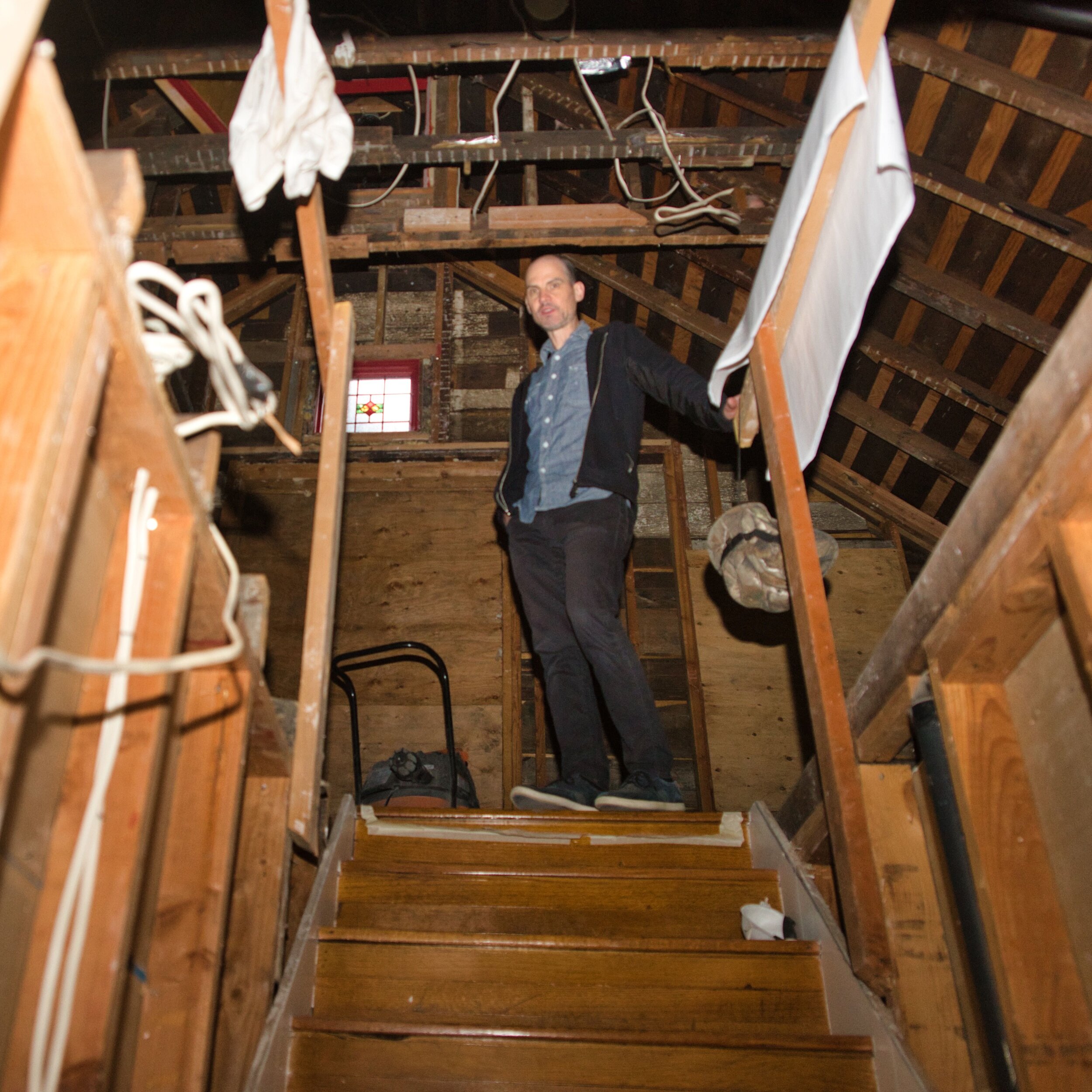
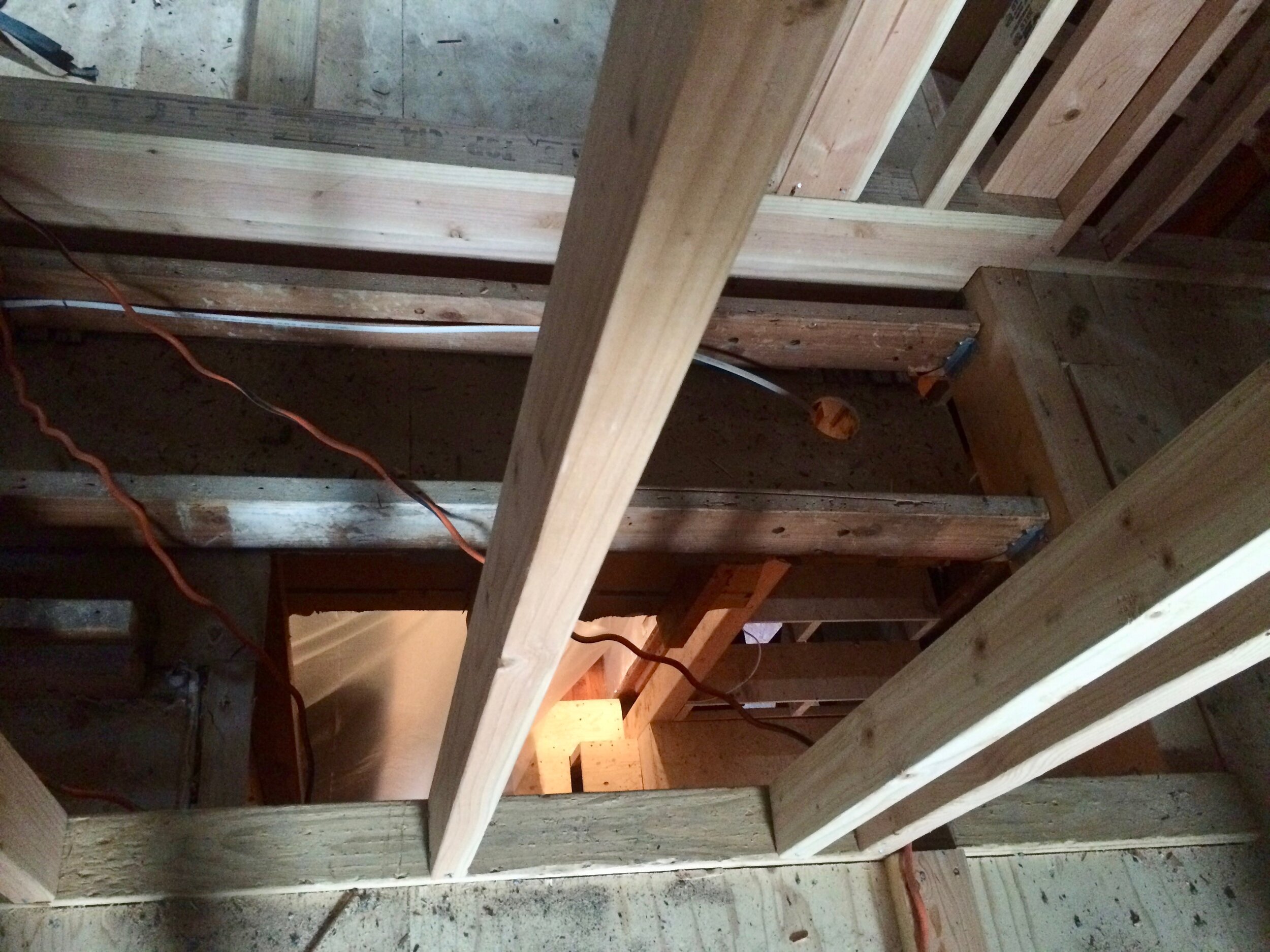
We had steep, creaky stairs with shallow tread in a very tall white corridor with a door at the top (used only once…when my niece was playing and locked it- we had to get a locksmith). My mother called these stairs a DEATH TRAP. For various code/construction reasons, we were sadly unable to keep them or the 2nd story flooring. Now we are glad: demo revealed another cut corner, NO MIDDLE STRINGER EXISTED. Death Trap indeed!




CONCEPT
Transitional Spaces: entryway, threshold, corridor, landing, portal. These perfunctory spaces can feel empty and impersonal. But not here! We aimed for integrated and intentional. I touched on our entryway concept in this post. Now, let’s take it to the next level (I mean the 2nd floor, ha ha). In this post, I’ll show you what I meant when I said ‘there’s gonna be lighted slat screen room dividers’ that unify 3 transitional spaces in our home.
SLAT WALLS + STAIRWELL
From non-existent non-spaces to Integrated! Intentional! Into it!
Creative use of wood slats in architectural design is not new. It’s everywhere: in Architectural Digest, all over Pinterest, and even at Chipotle. Open slats form clear boundaries, yet allow light and noise to pass through. They add drama, texture, and look super cool. However, the architectural renderings we had were just lines on a page, the details were undefined. Todd and I spent many hours discussing wood thicknesses, edge details, router bits, how to tie the slats into the existing beams, how to light them etc etc. It was complicated. slow. custom. expensive.
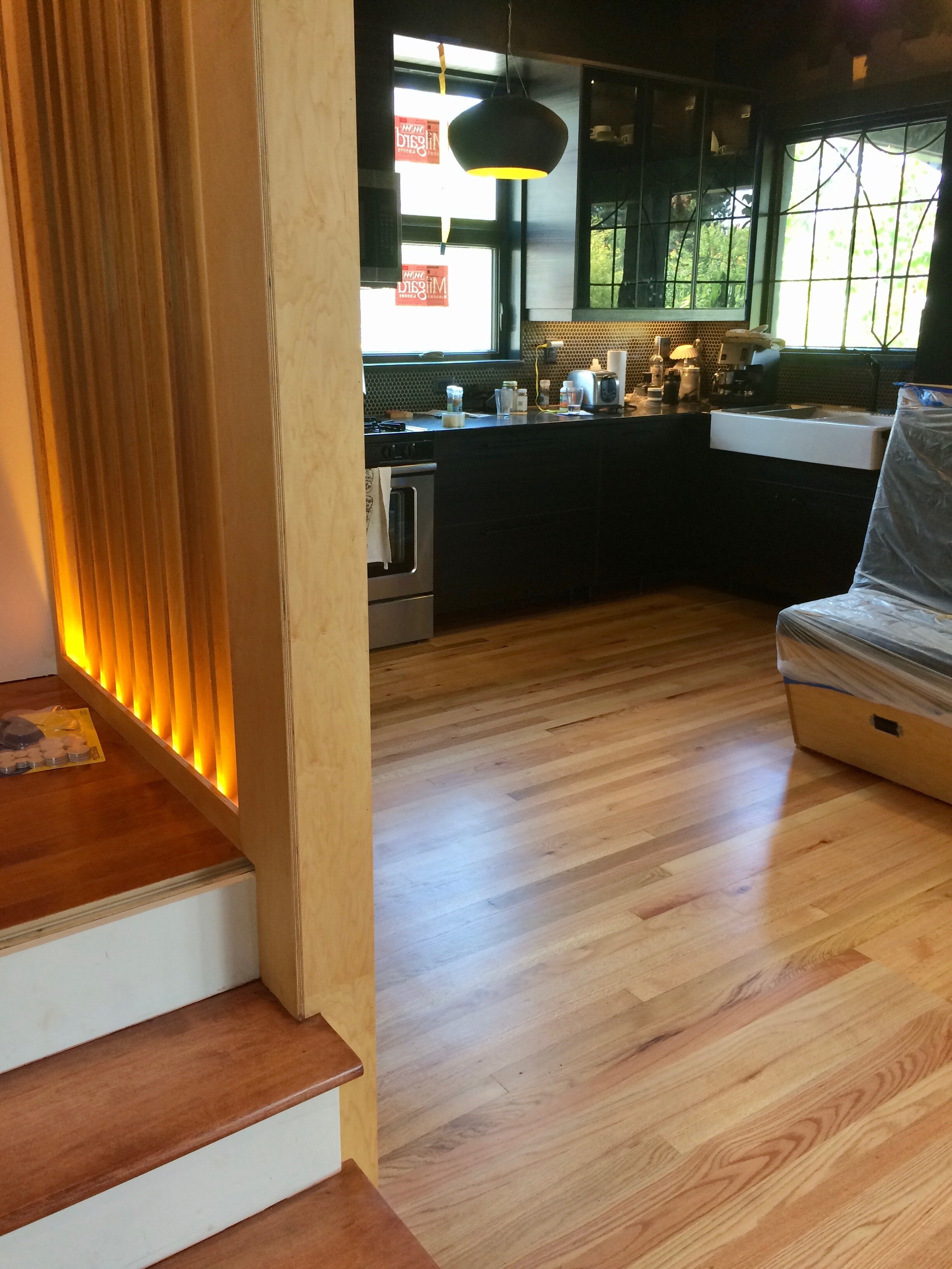
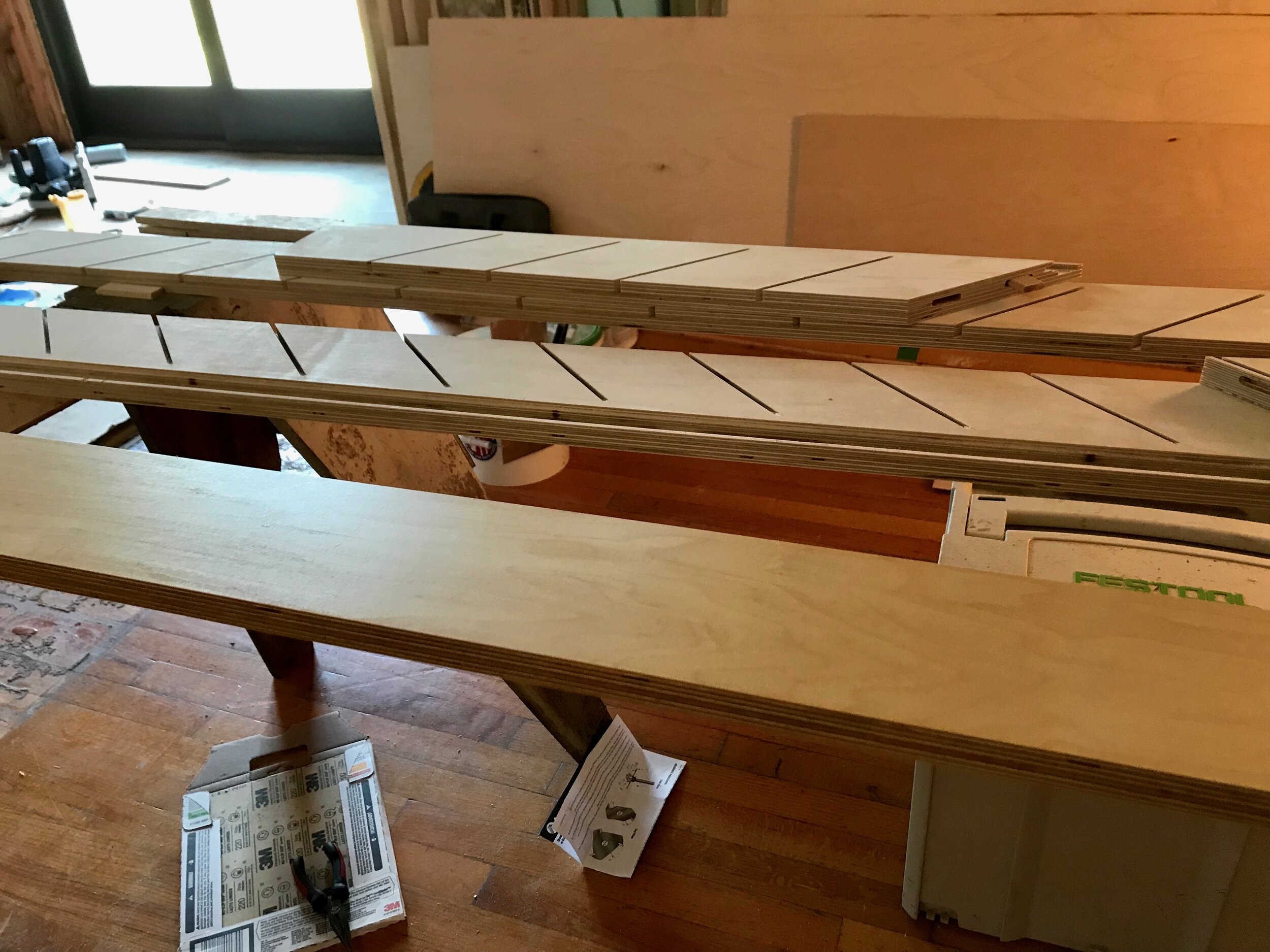
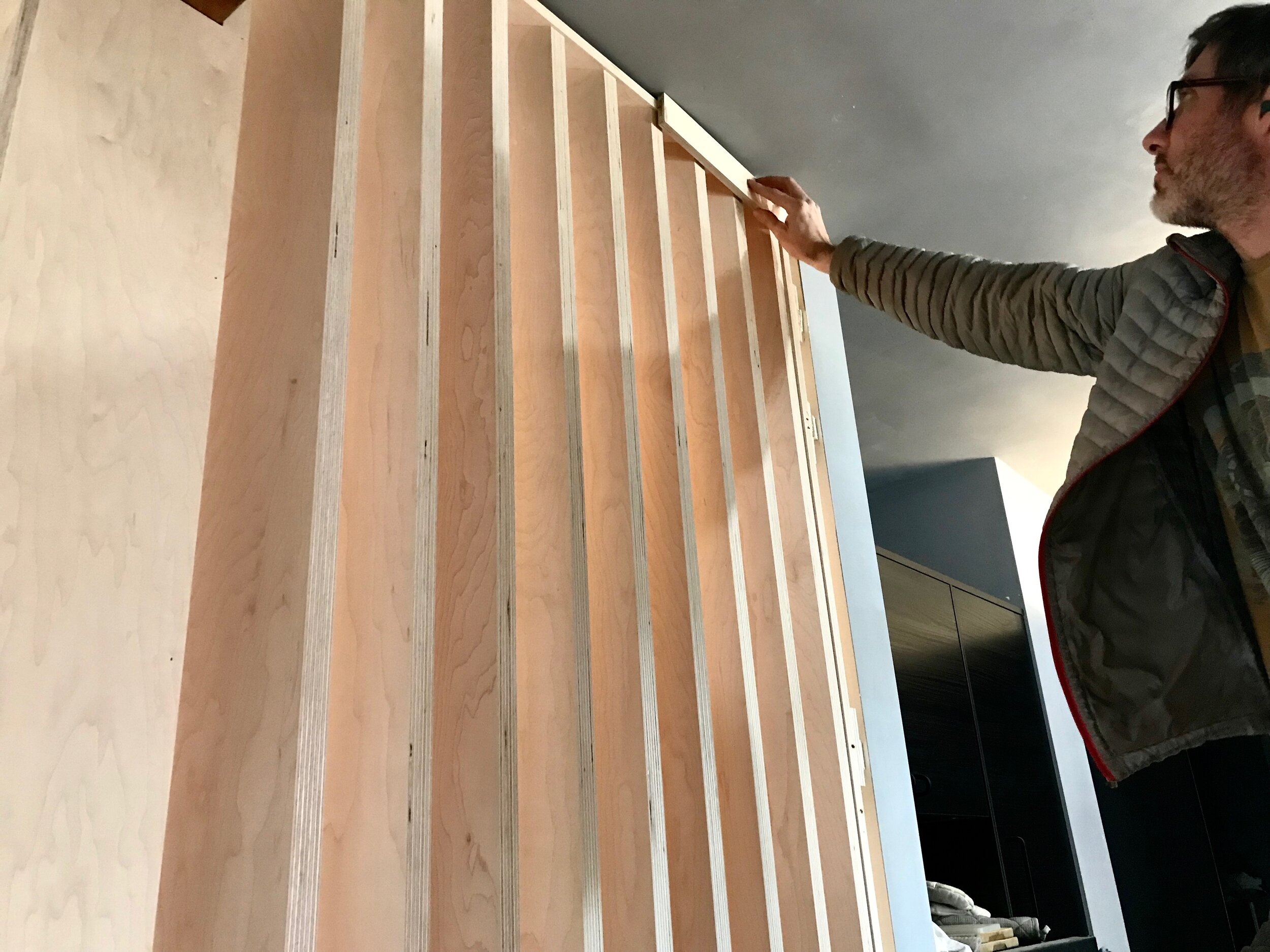
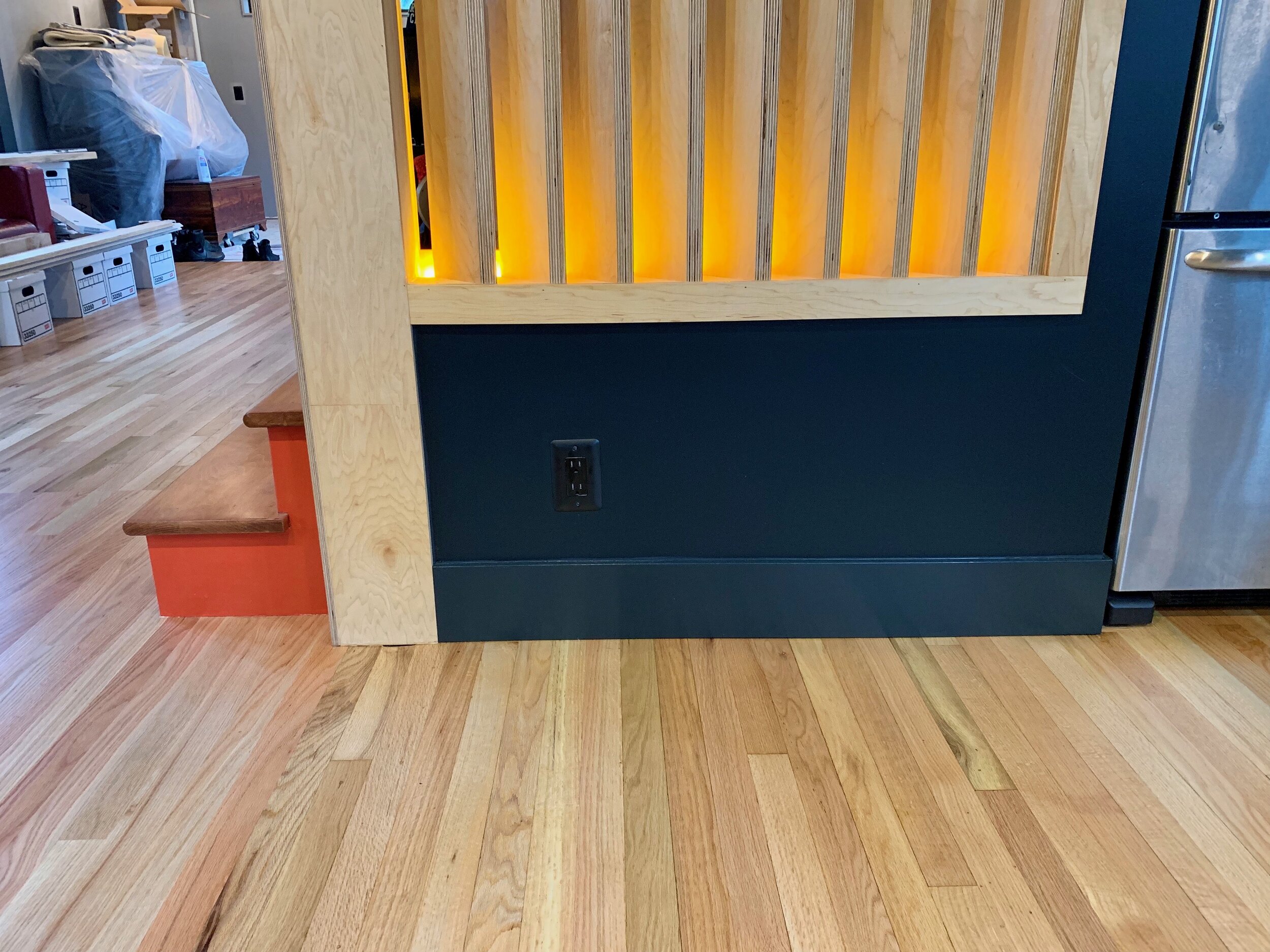
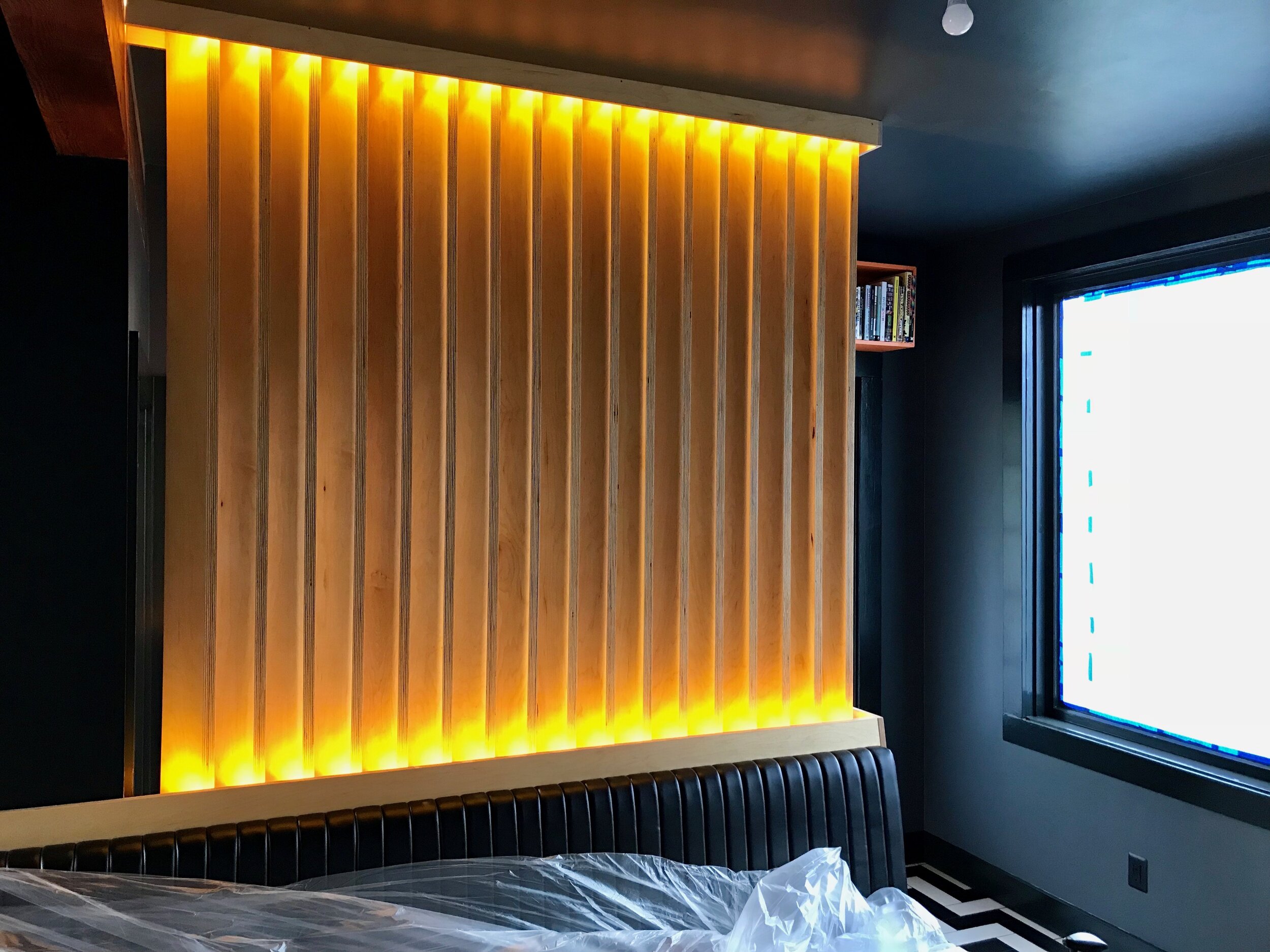
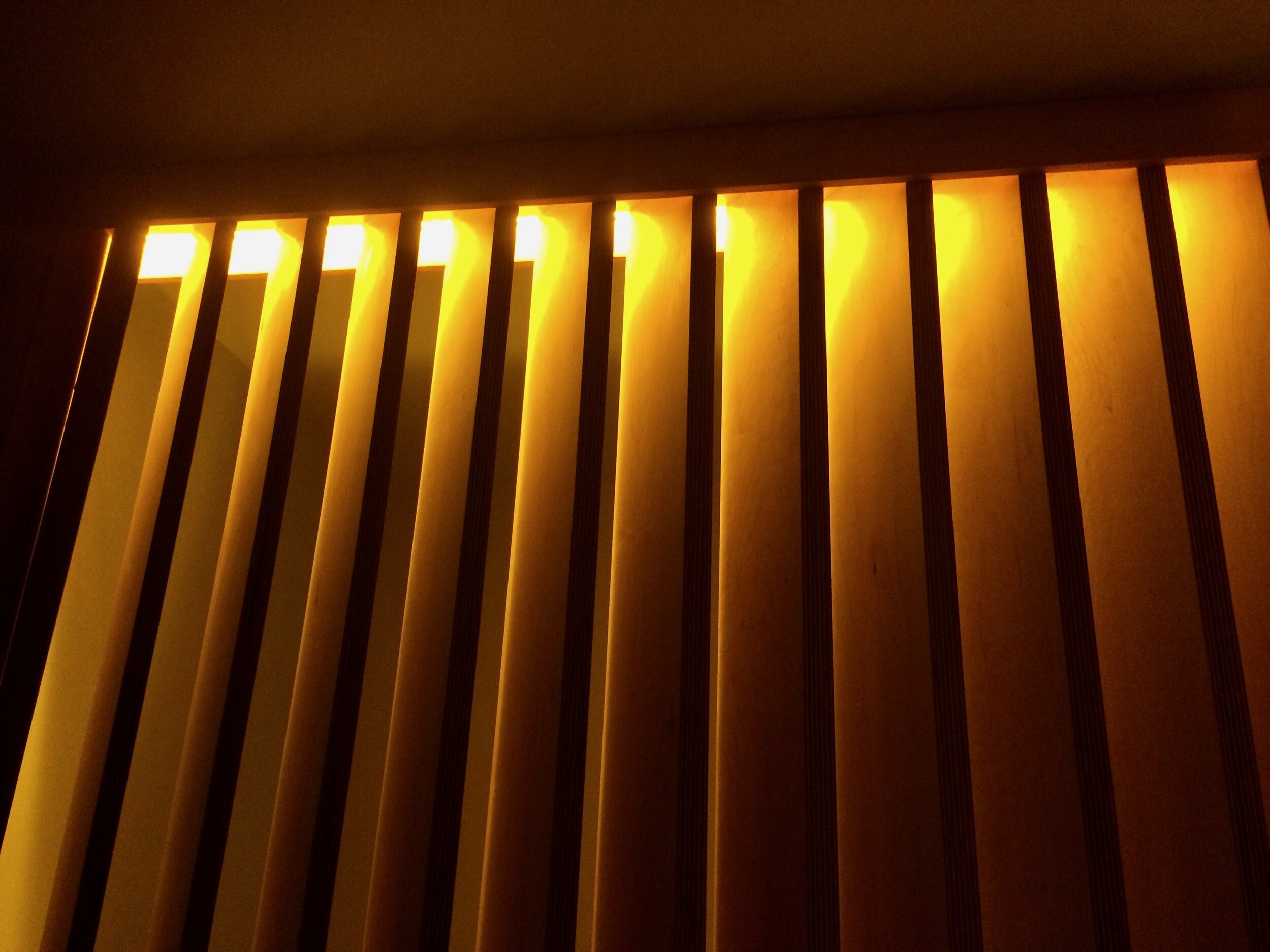
At Creative Woodworking NW our apple ply was cut down to about 60 slat pieces for 3 ‘walls’; the upstairs hall, the landing, and the entryway. To add complexity, the slats were cut at 45 degree angles, like parallelograms rather than rectangles. They would be set in rows at a 45 degree angle and lit by inlaid LED lights at the top and bottom.
DIY:
I methodically treated all the plywood in the house with Rubio Monocoat that I bought at Sustainable NW Wood. It protects, brightens, and amplifies the grain/character. After light sanding and cleaning, I rubbed in the goop, waited, then wiped it down. Miles and miles of wood…



THE HALL:
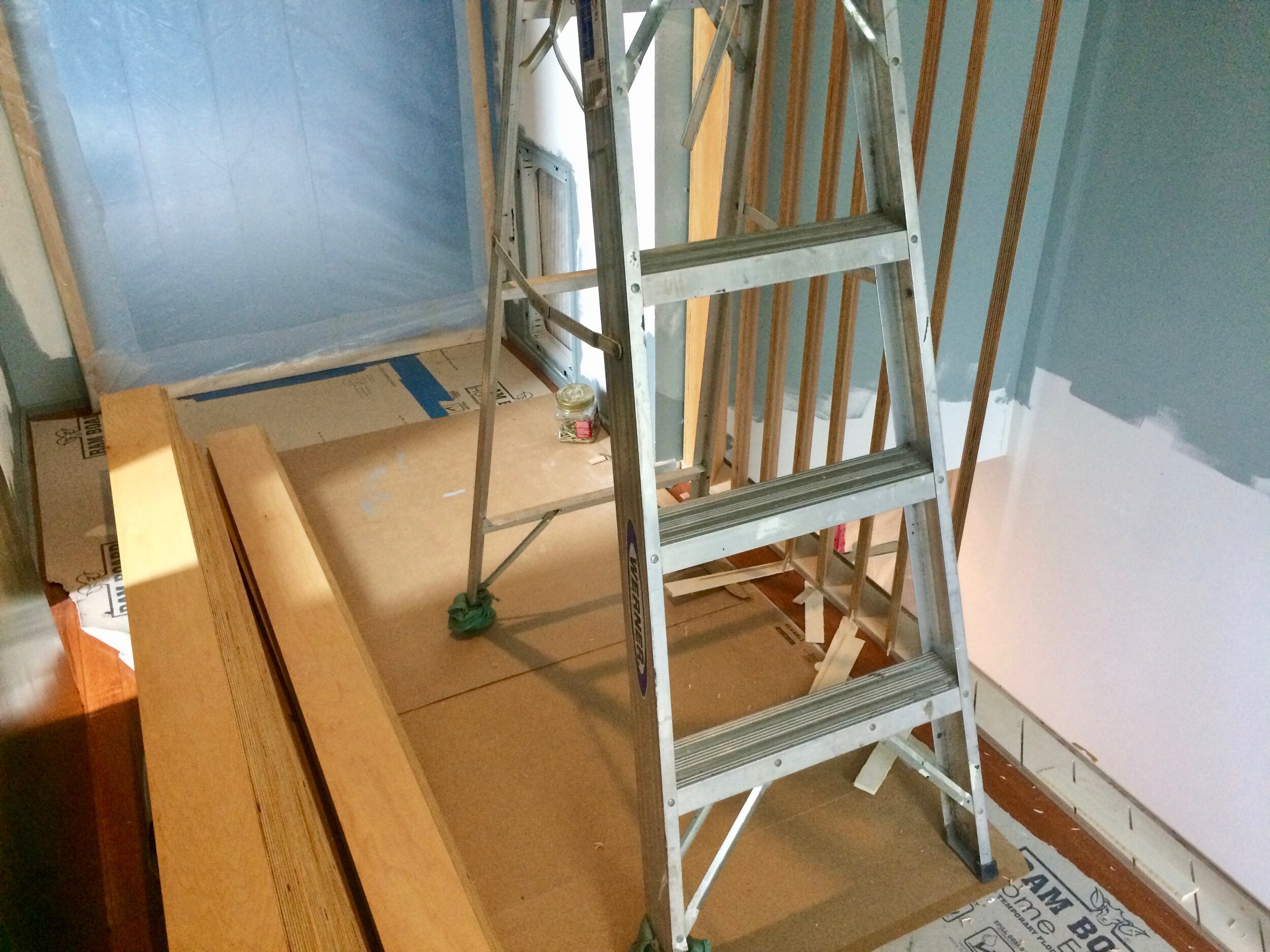
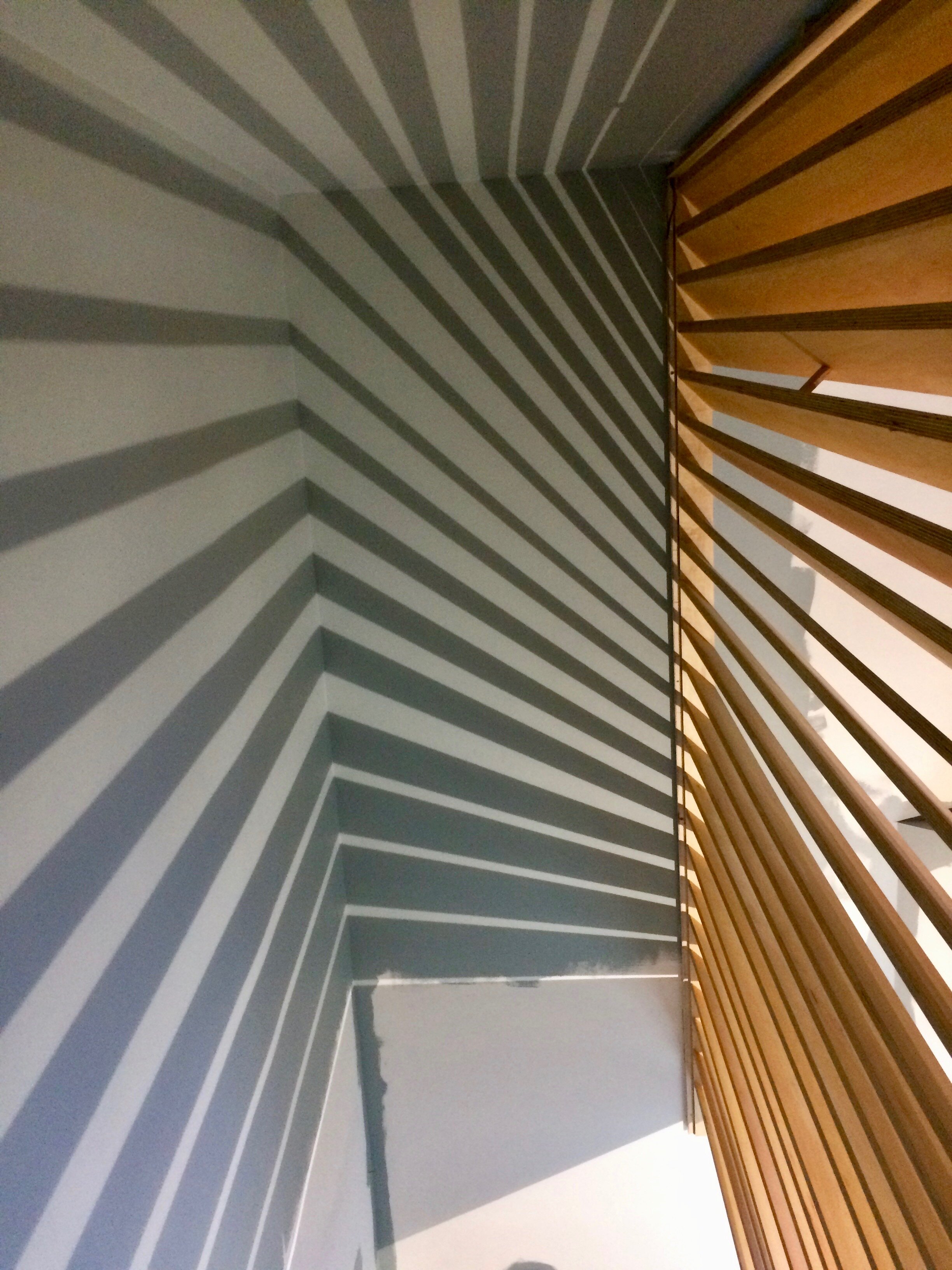
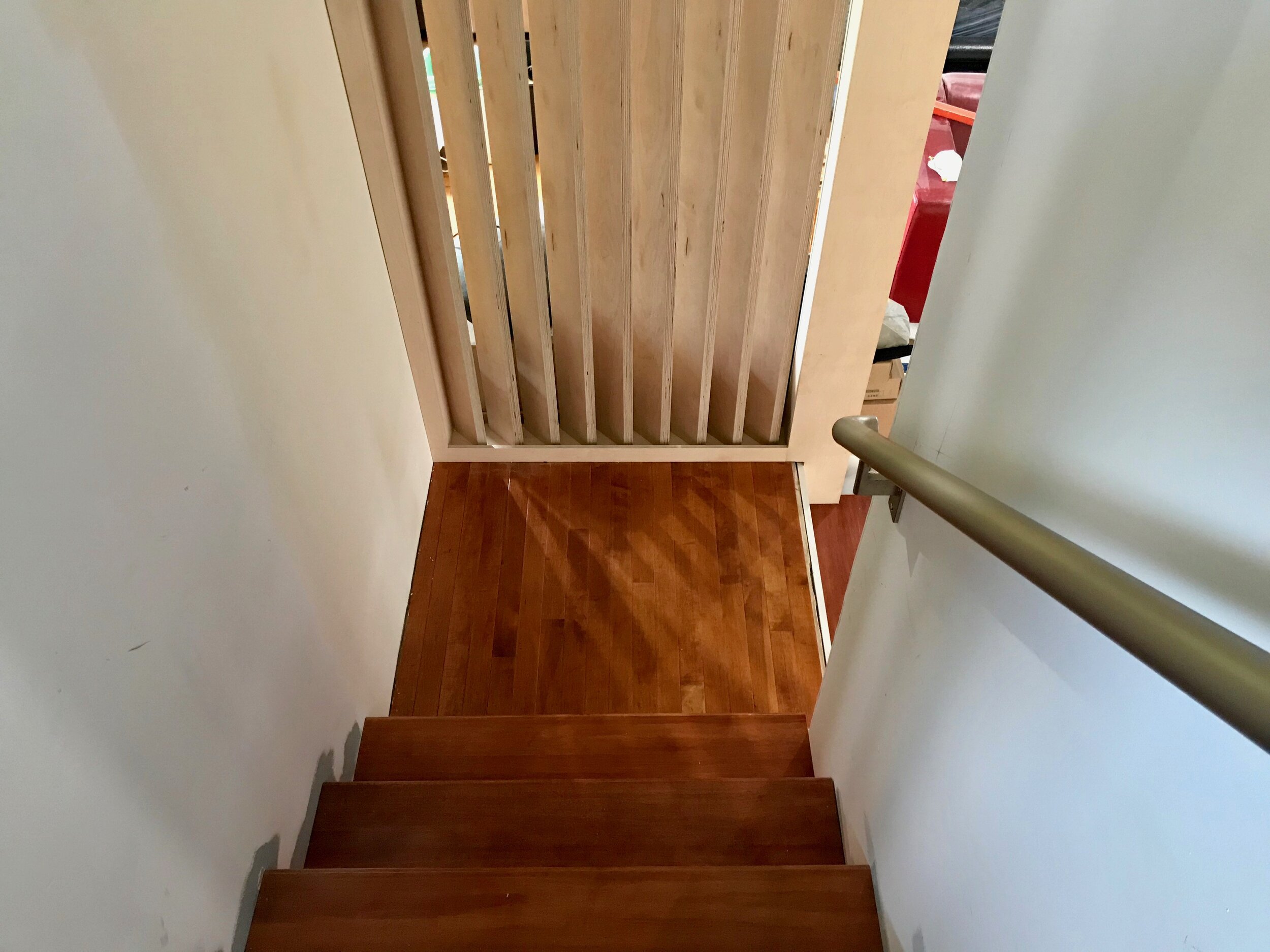
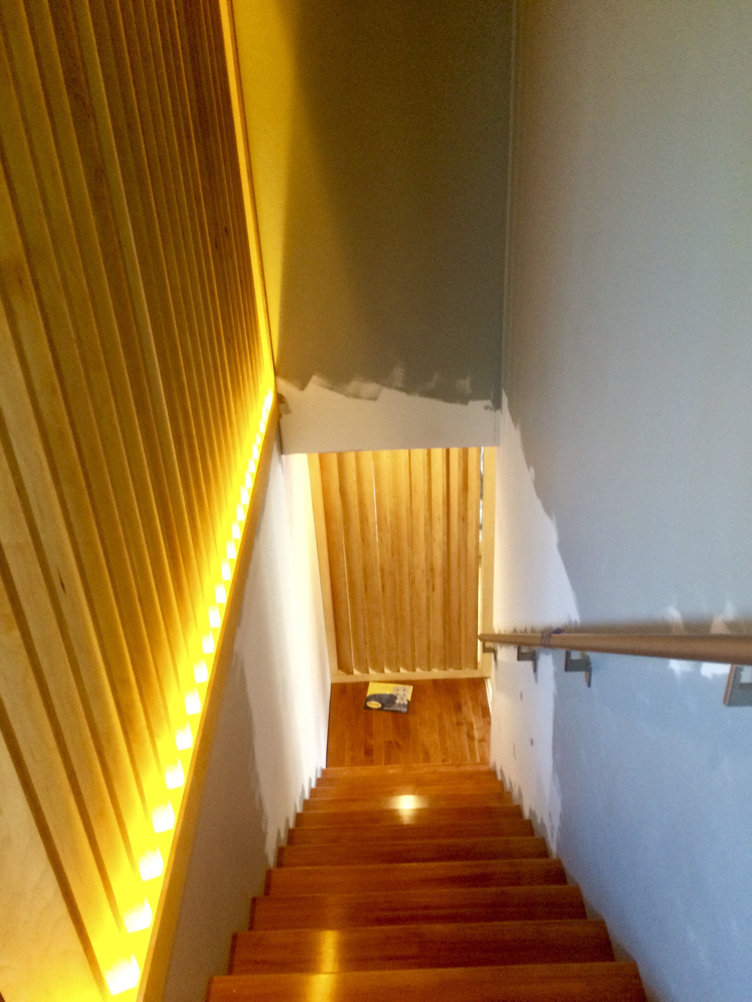
Before, our hall and stairwell felt claustrophobic, isolating. The slats open and energize the space, extending from ceiling to floor. We may add a railing to them in the future.
THE LANDING:
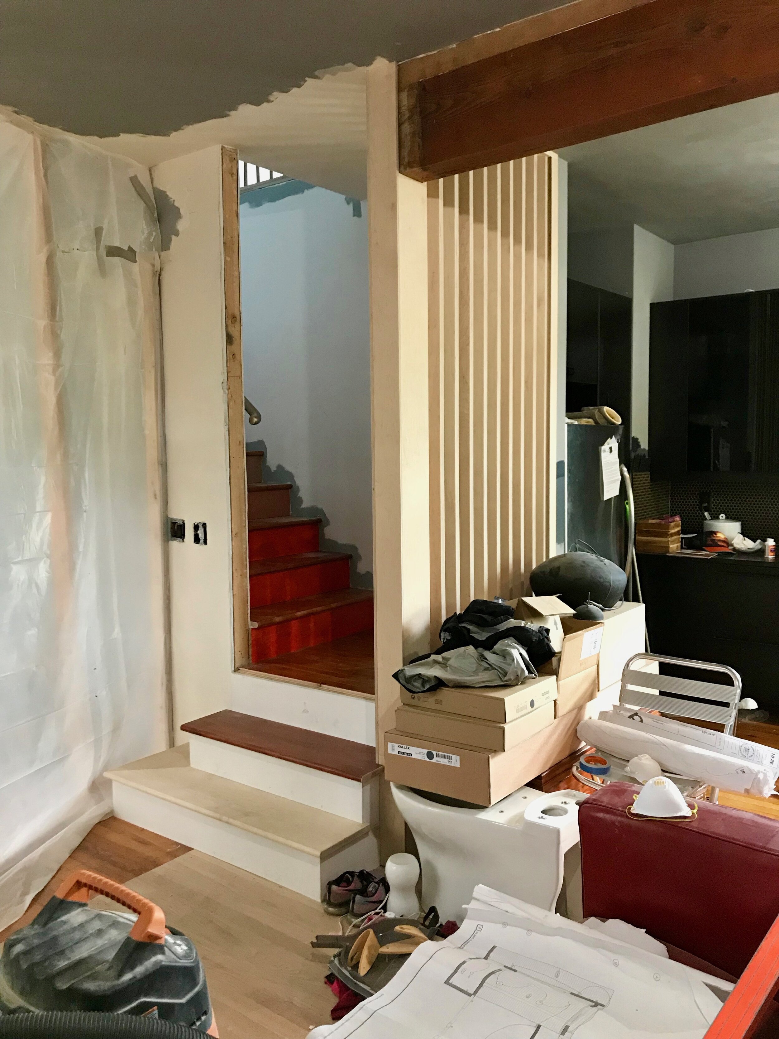
Now that the stairs turn 90 degrees, a landing spills into the living room. It’s a nice spot to gather yourself! The slats there offer a modicum of privacy for anyone in the stairwell and tie into a big chunky beam that we also wrapped in apple ply.
THE ENTRYWAY:
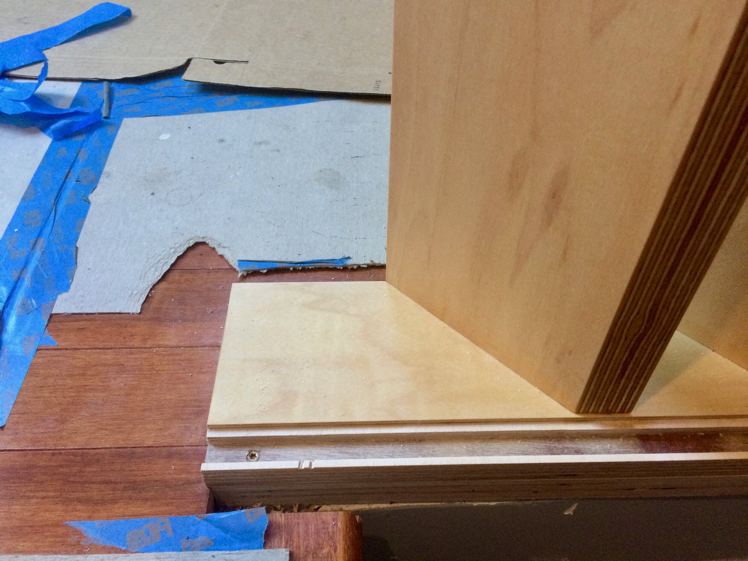
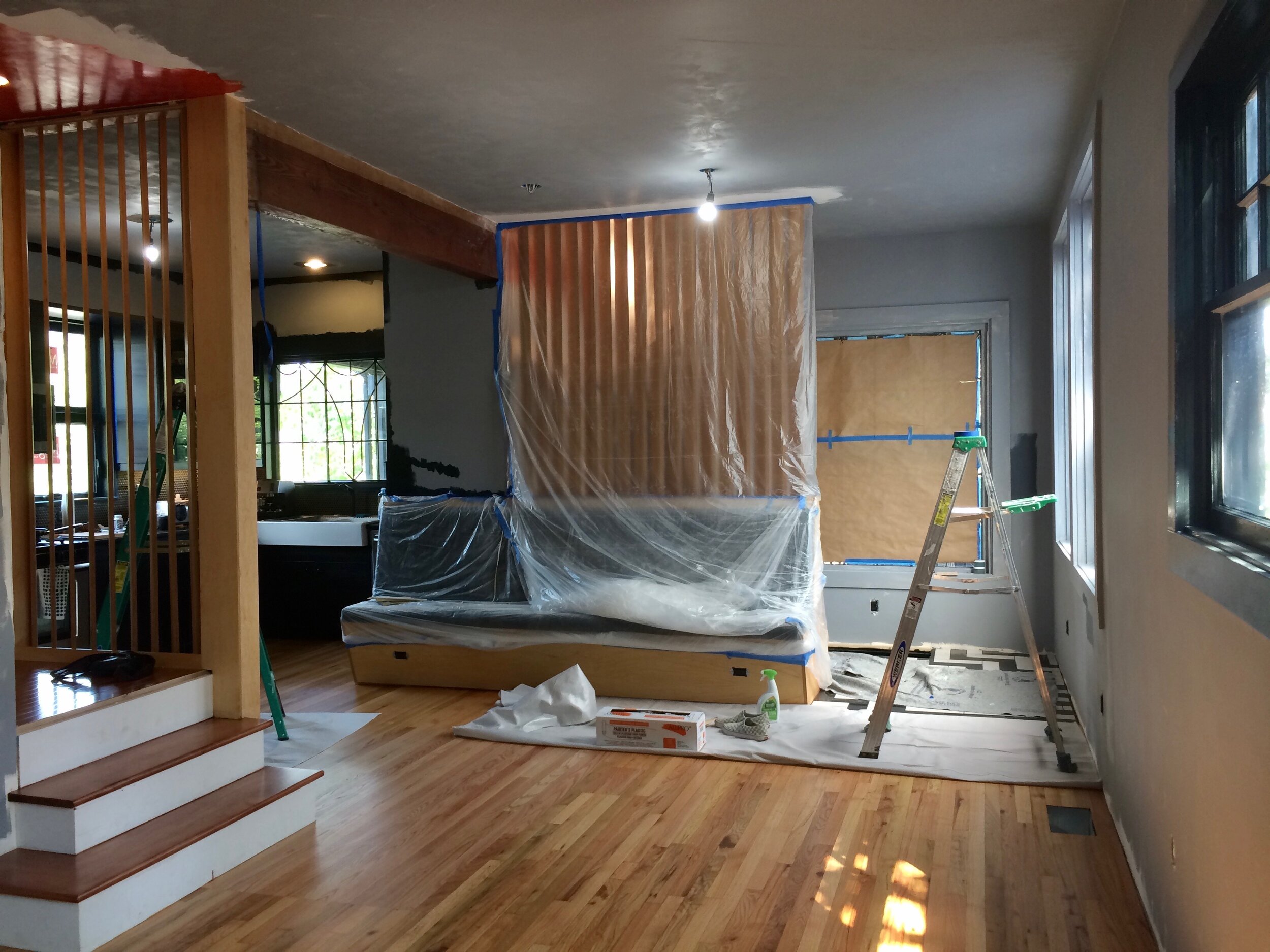
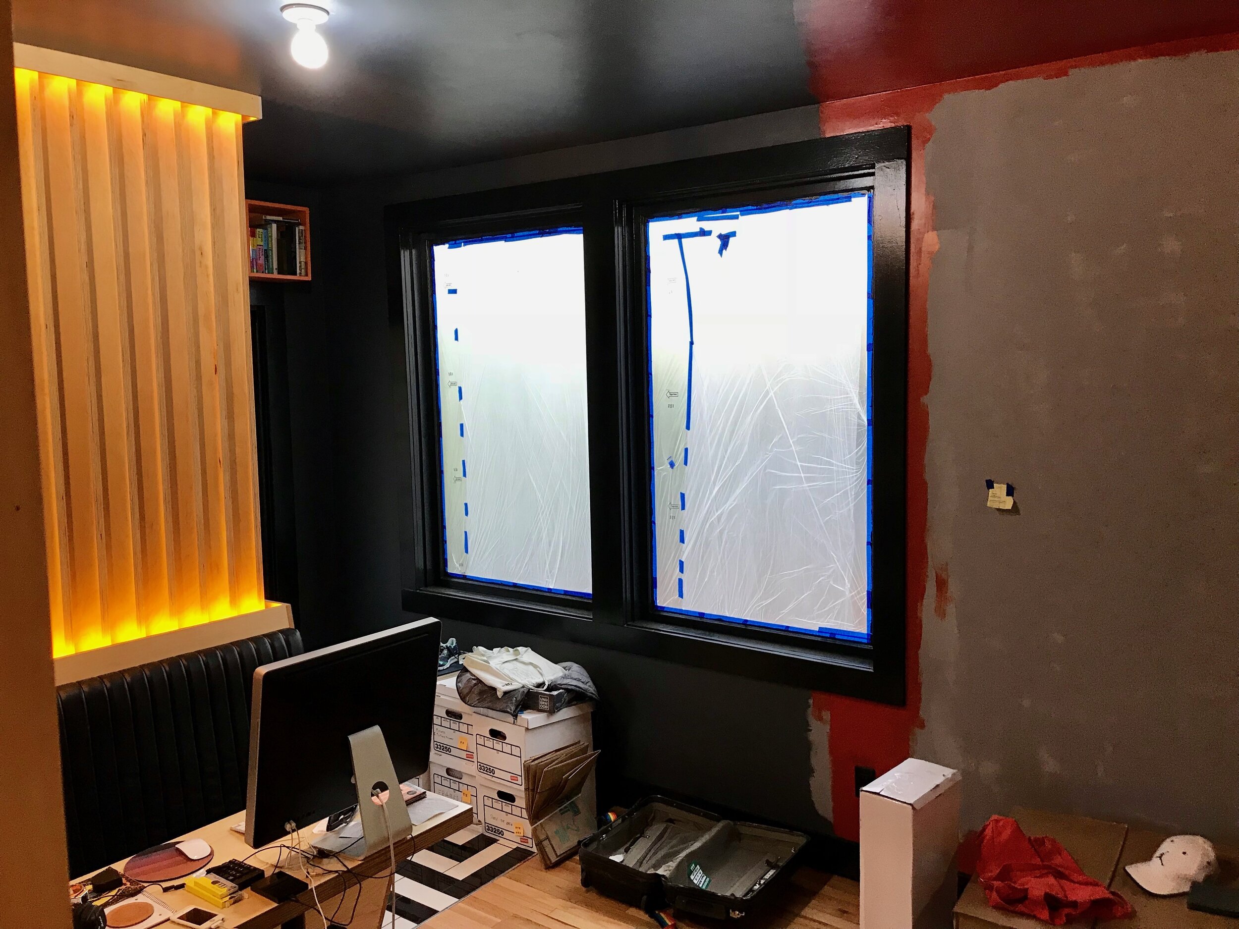
Slats make up the back of our banquette seating and initially block the view into the space, so one can effectively pause to perform those little extra-dimensional rituals we do to change from our public to private self (ditch the shoes, the coat, the inhibitions etc). It’s a slow reveal around the corner.
Let’s have a look.






AFTER
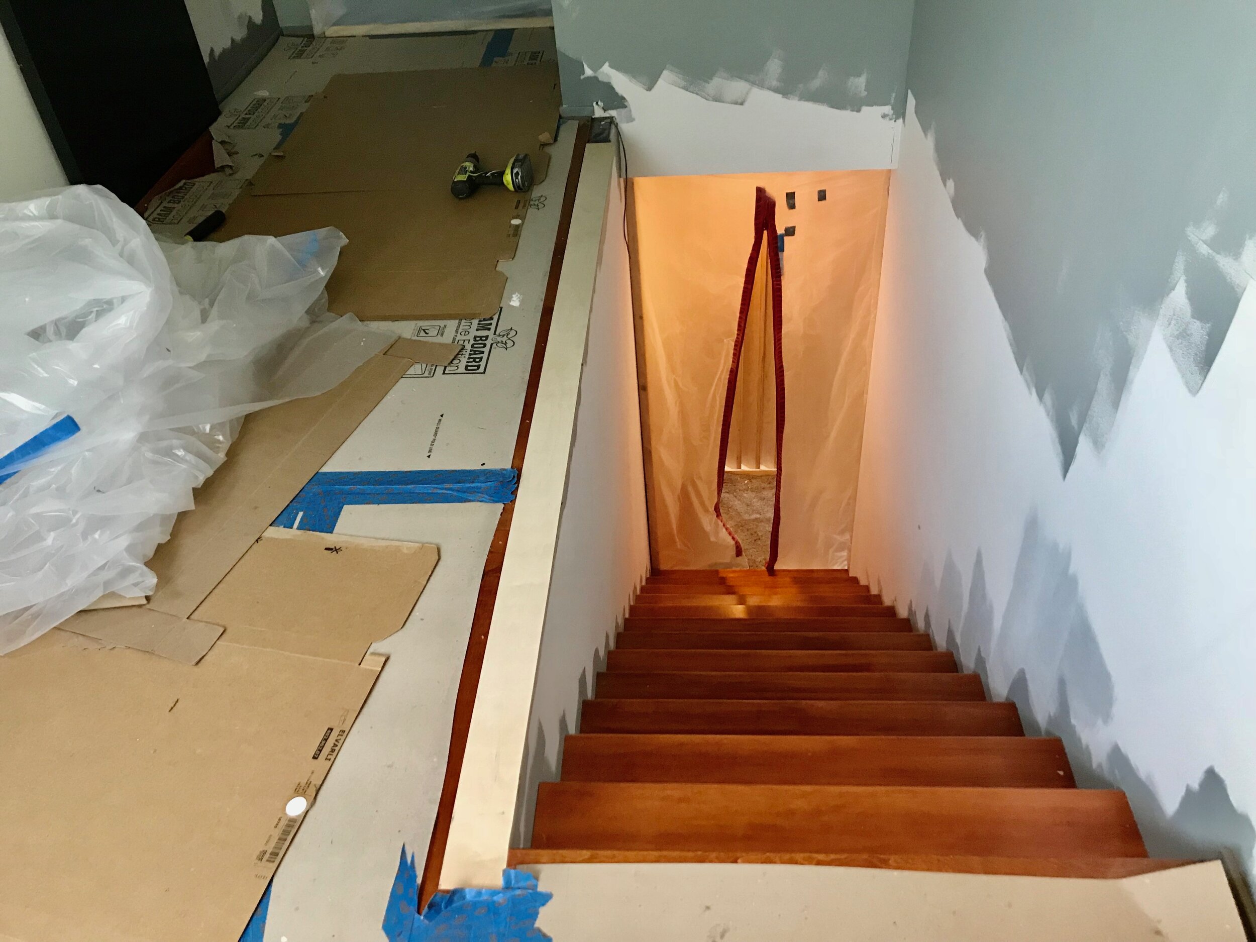
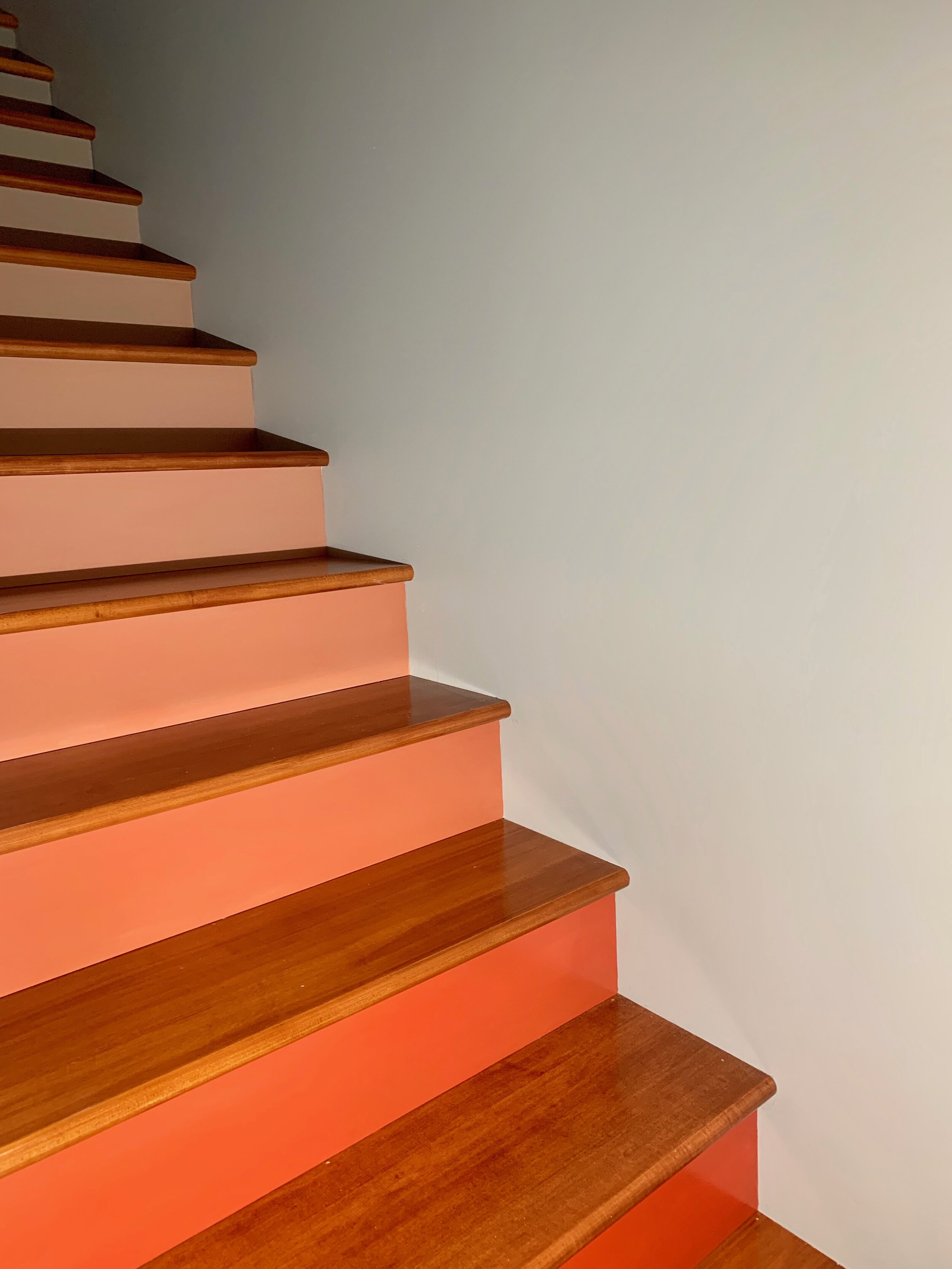
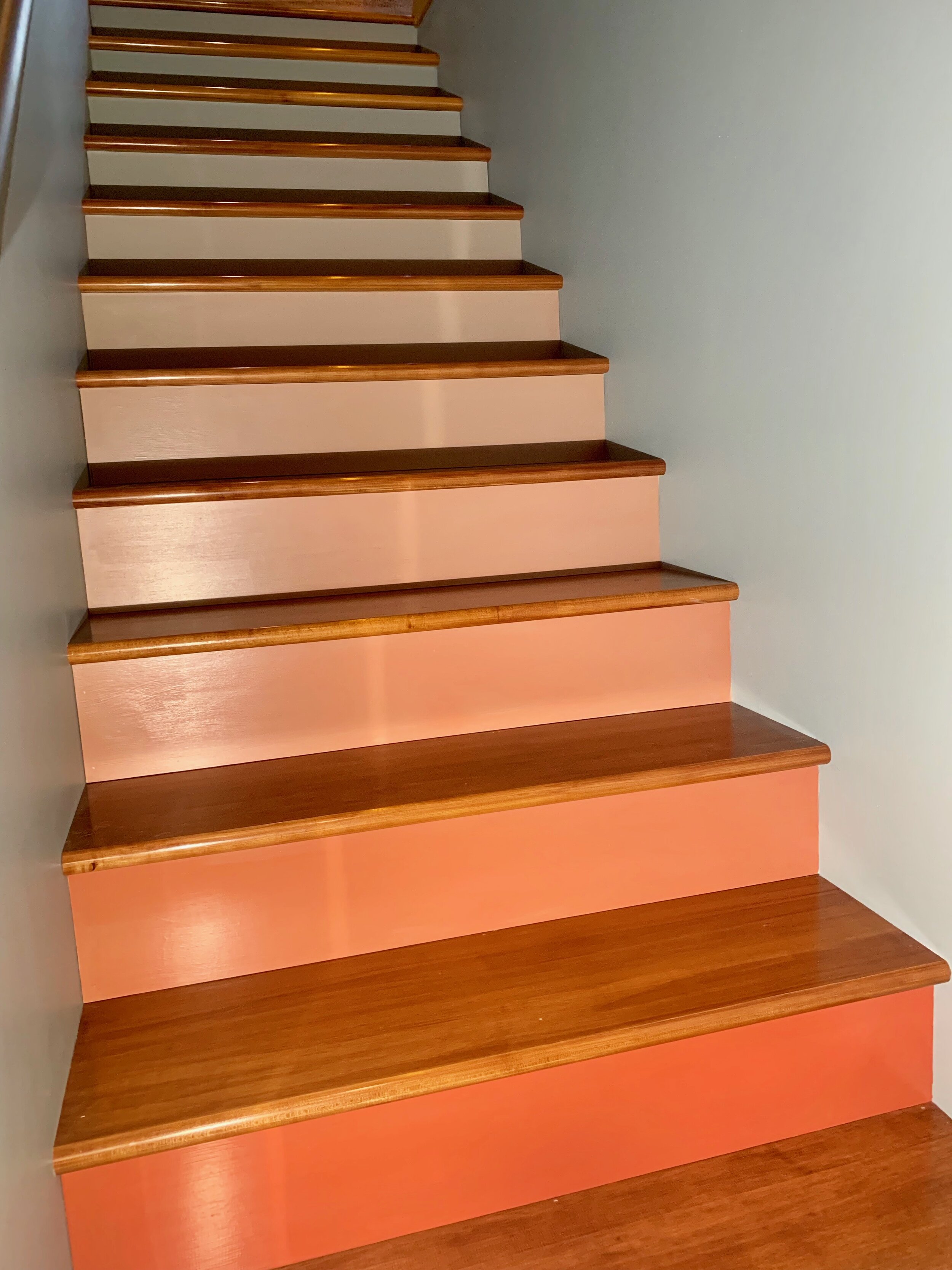
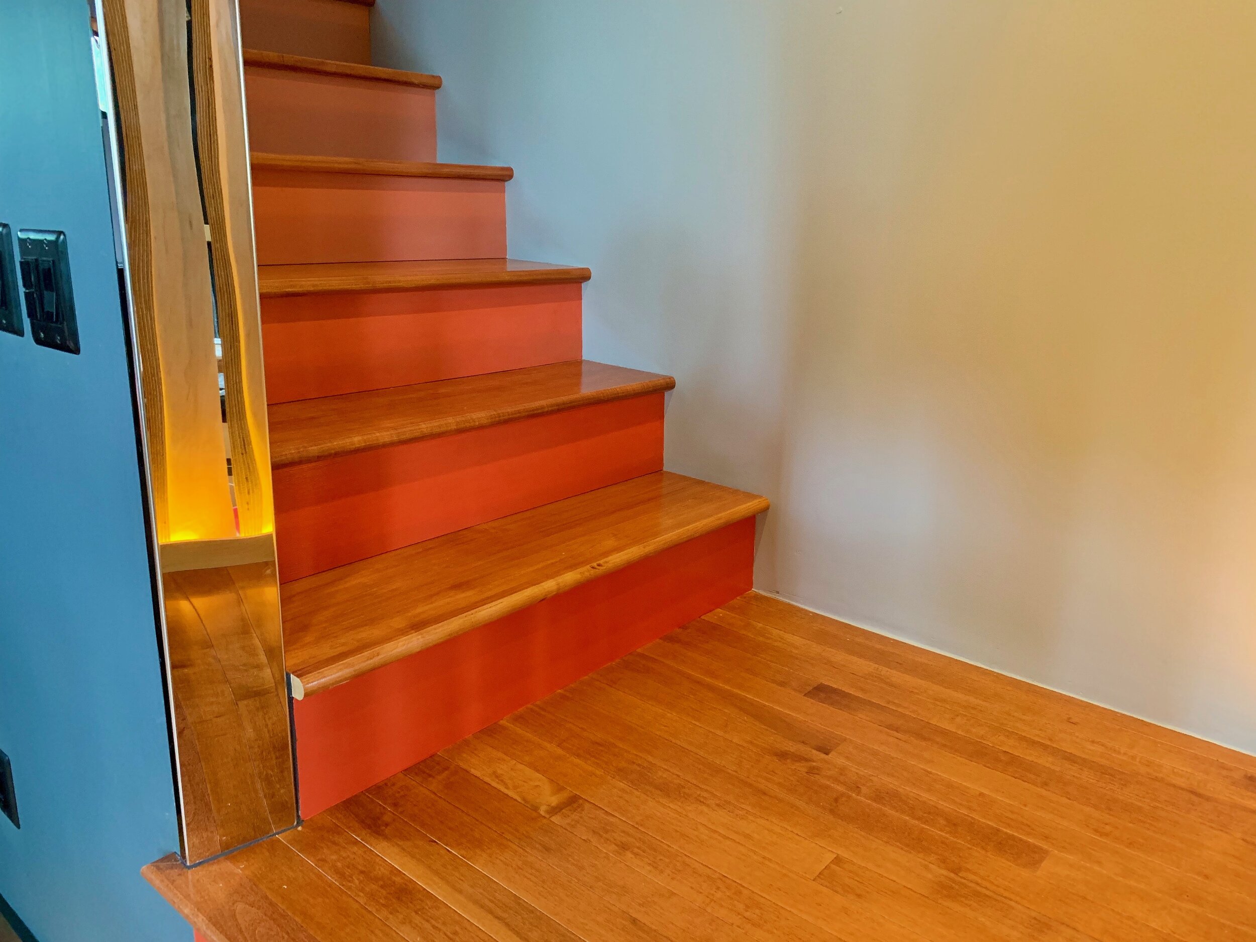
Afterthought spaces are now integral features that guide and articulate the space both structurally and psychologically. Stairs have large tread, better ergonomics, a cool champagne handrail (from this company), and an ombré paint job from TOMATO TANGO (downstairs drama) to SILVER MINK (upstairs chill). THE PLAN WORKED! These pictures don’t do it justice…you will agree once we get to all the graphic murals.





NEXT UP: The surprise I painted for Mike while he was on tour…

