
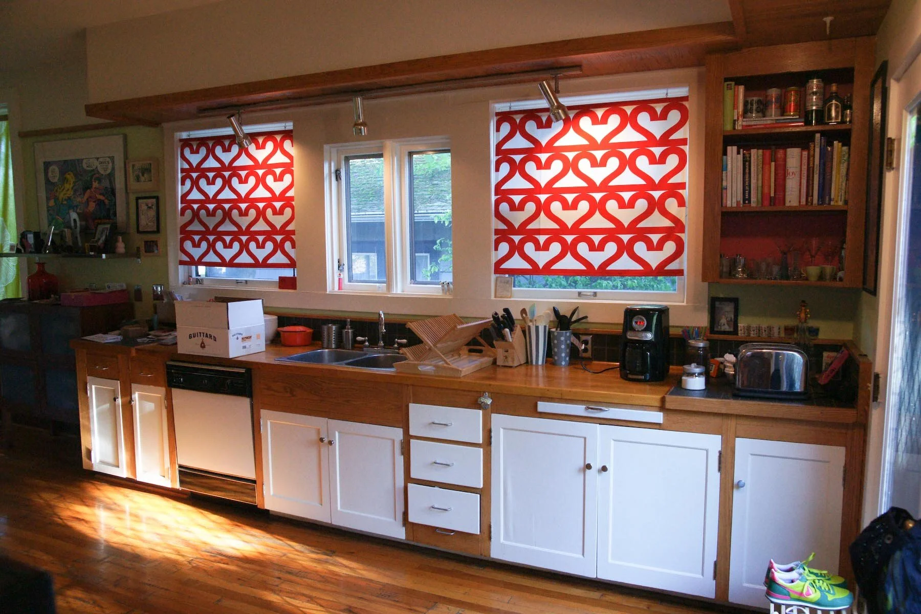
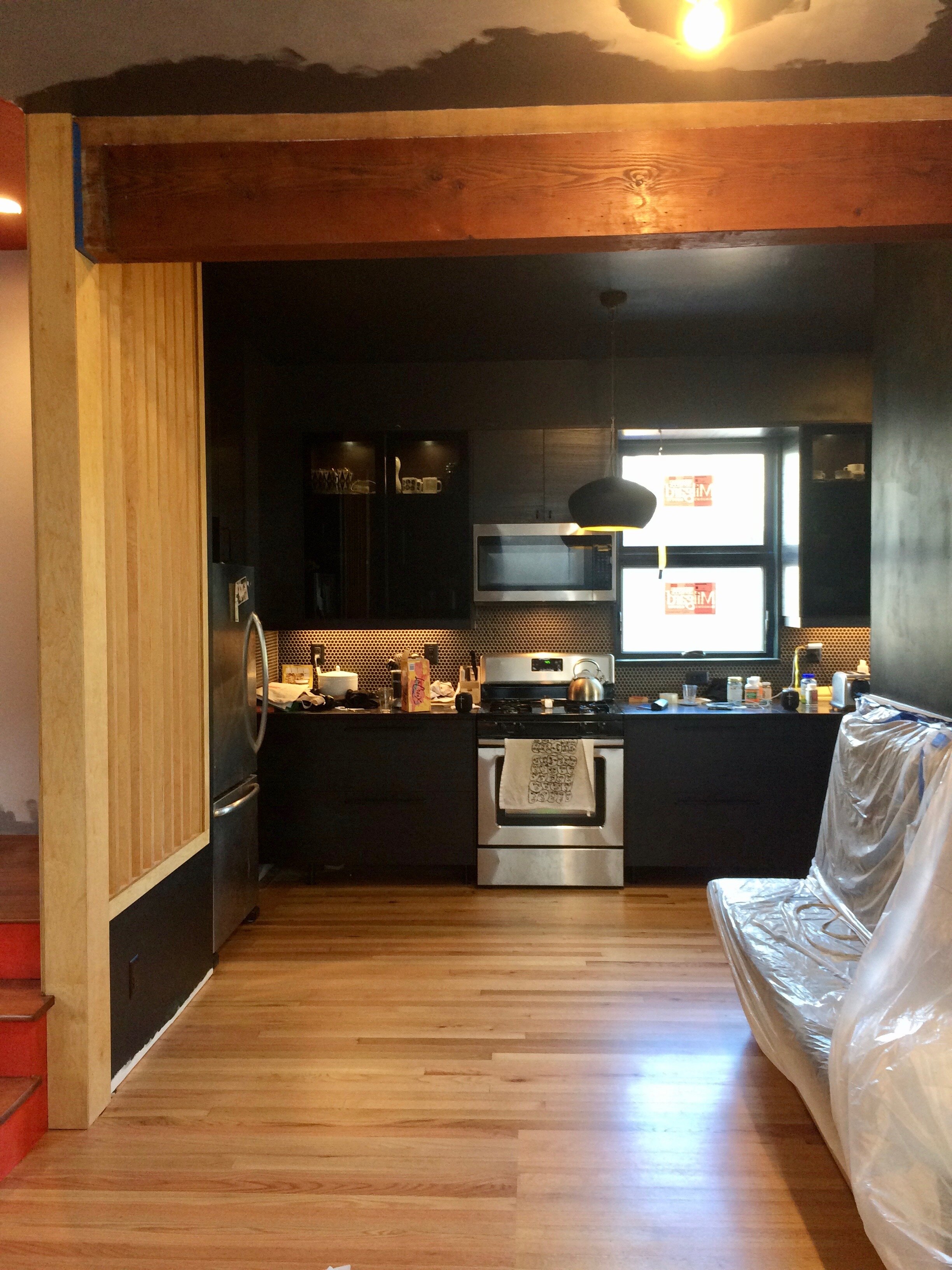
BEFORE
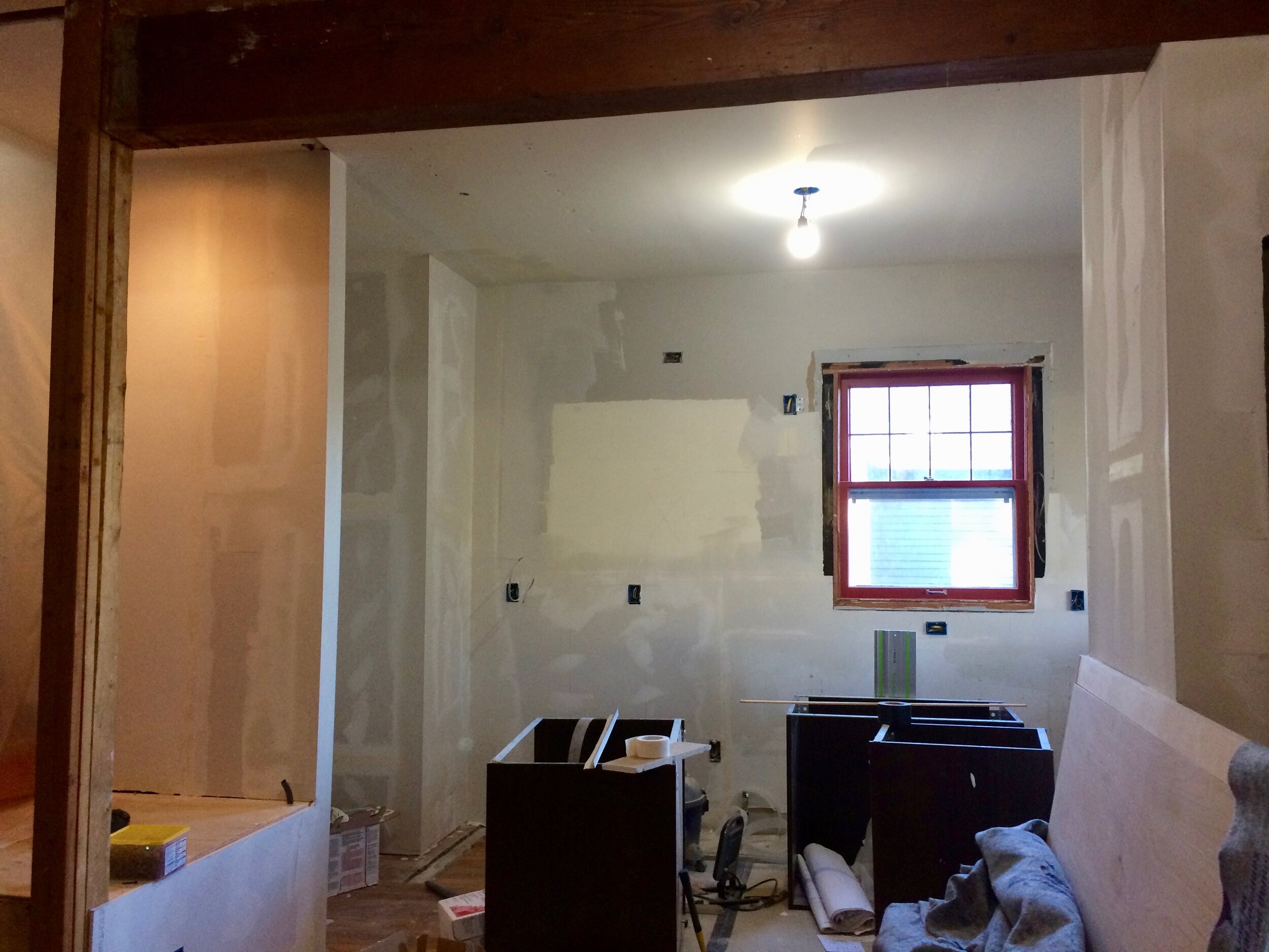
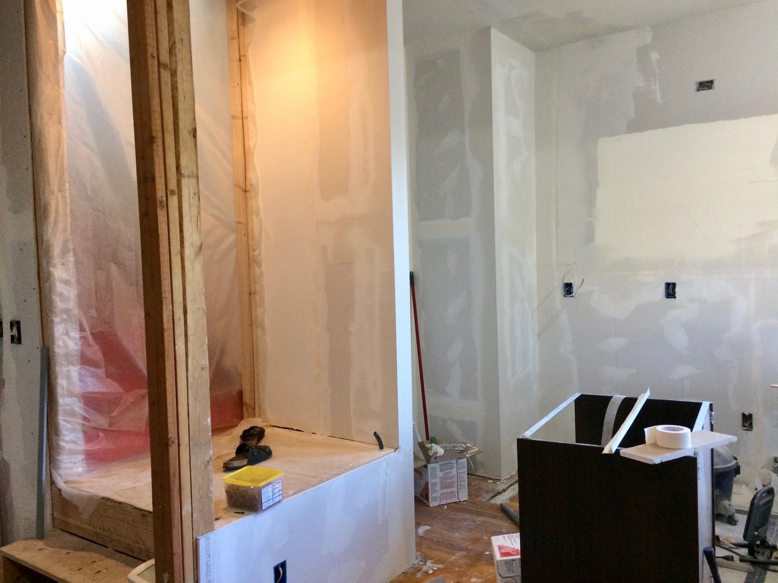
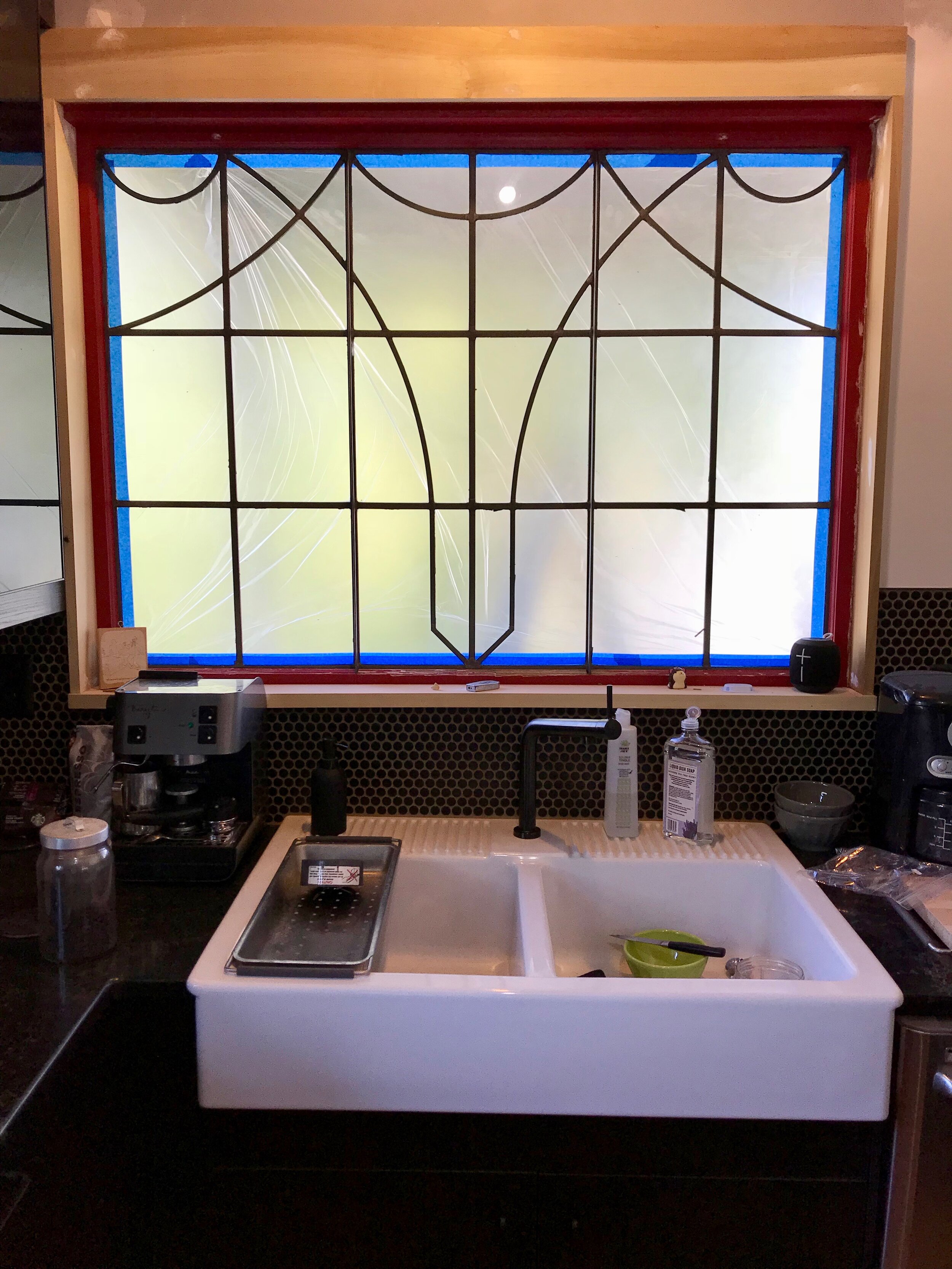
Our galley kitchen badly needed a functional upgrade. The biggest design flaw: the enormous gulf between each side. An island wouldn’t solve the problem; it would block the only path to the bathroom and no doubt I would incur serious hip bruises from running into it. The kitchen windows looked directly into our neighbor’s house. The counters were uncleanable: made of roughly grouted tile and leftover floorboards heavily coated with polyeurethane. Okay, this just looked bad and did resemble a boat galley because of ALL THAT YELLOW WOOD. The sink surround was rotting. The stove was from the 80’s; all the markings on the knobs had worn off.
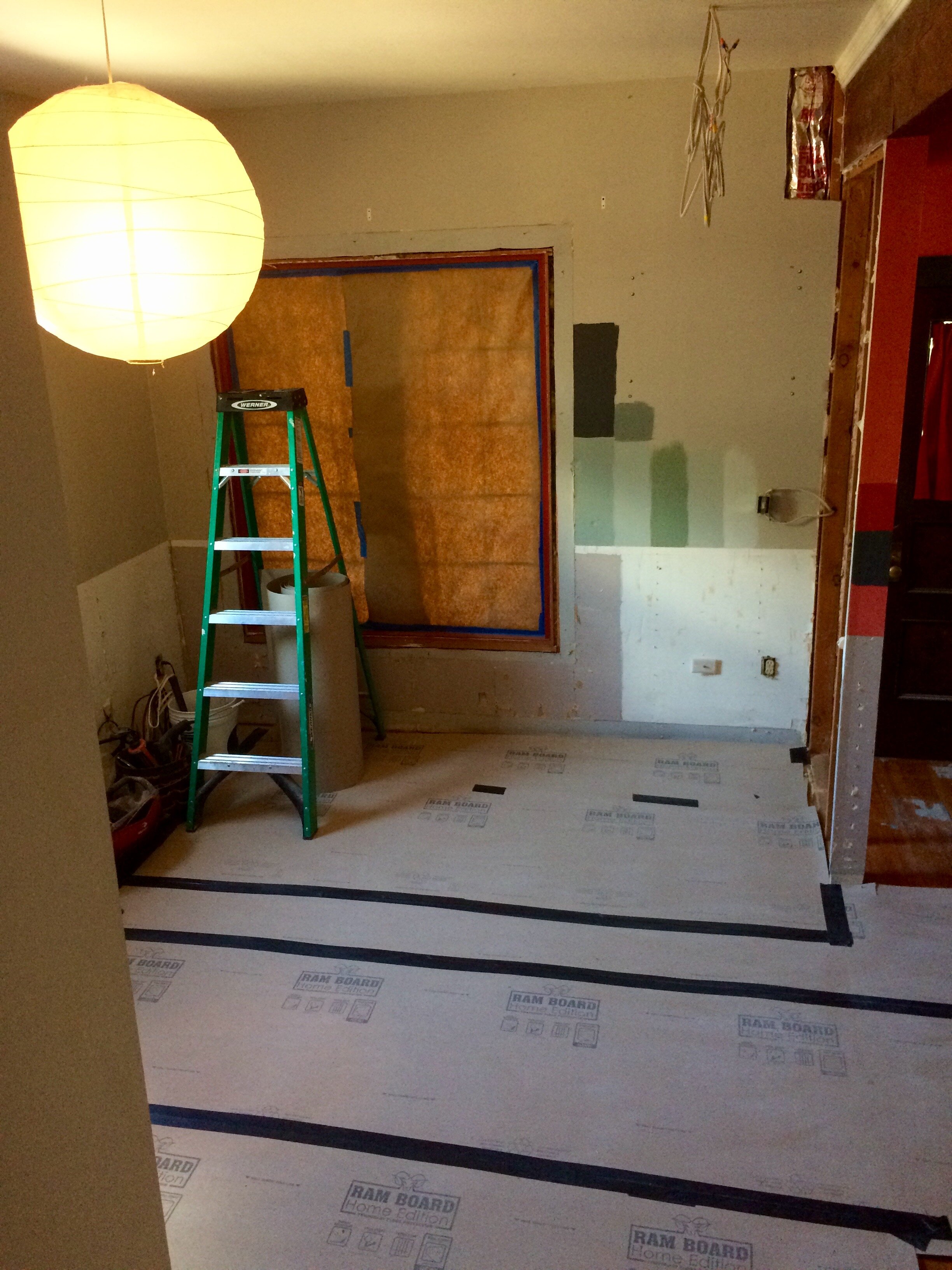
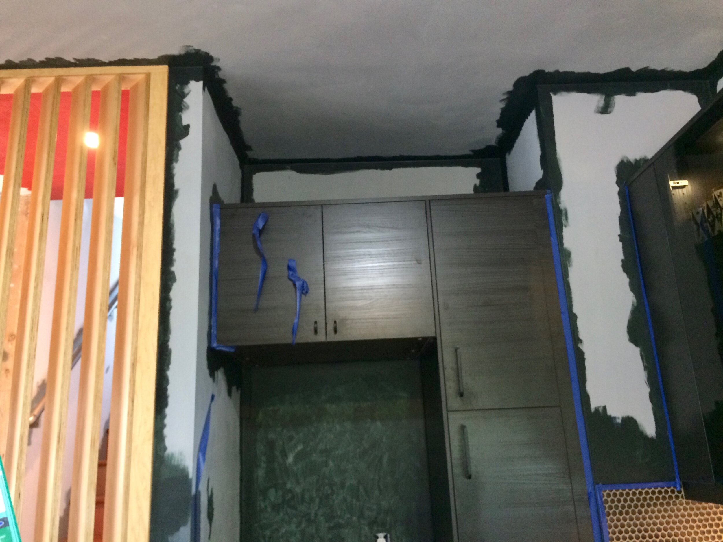
Other issues we found upon demolition: Above-cabinet soffits DID NOT VENT OUTSIDE, aka WERE A TOTAL FIRE HAZARD. The sink and washing machine were NOT HOOKED UP TO THE SEWER and were DRAINING INTO OUR BACKYARD!!! We never would have known any of this if we hadn’t decided to swap our kitchen with our living room, the most mind-blowing idea that our architect Steve Ewoldt came up with.


SWAP LOCATION
to increase function
CONCEPT
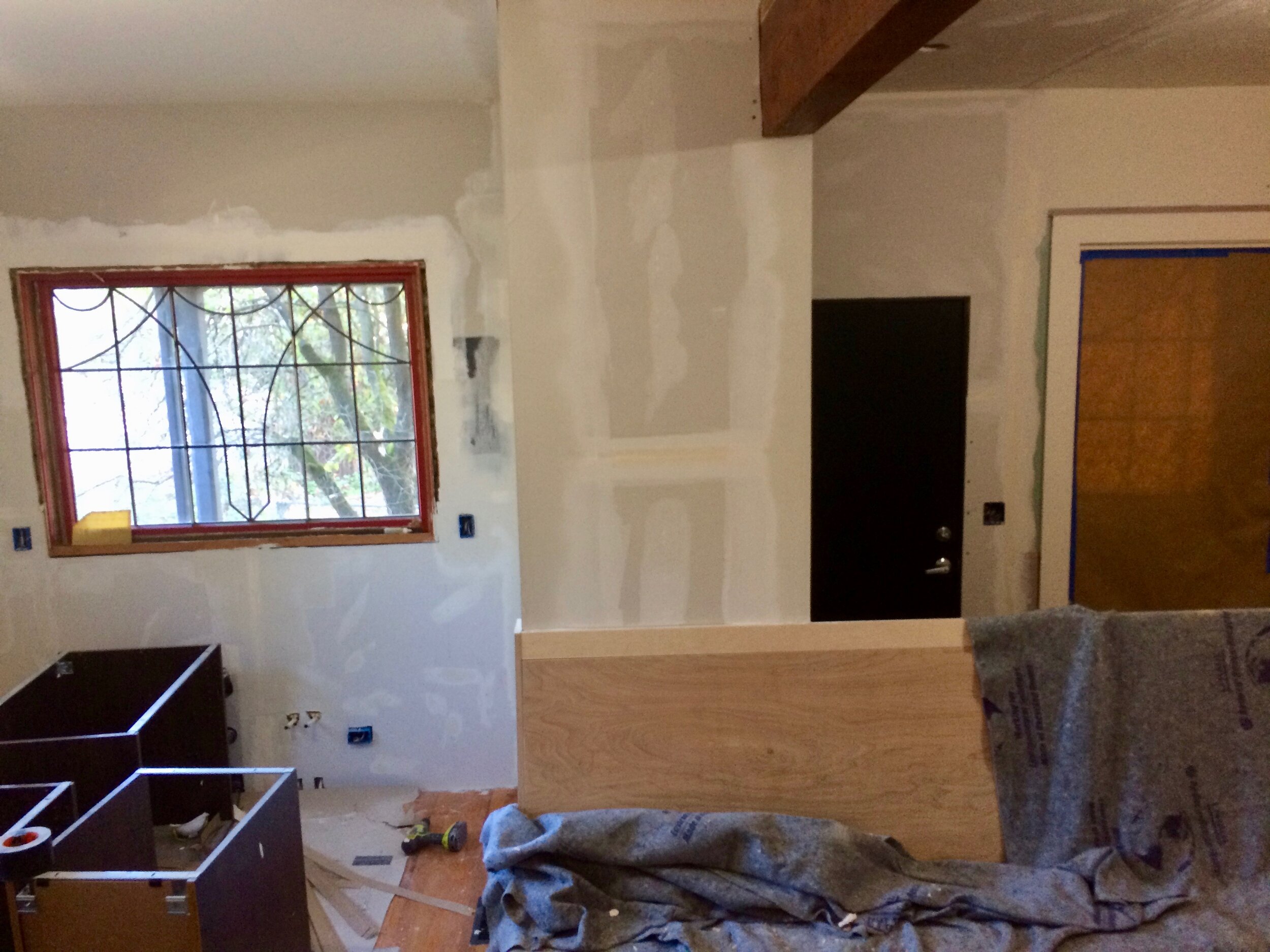
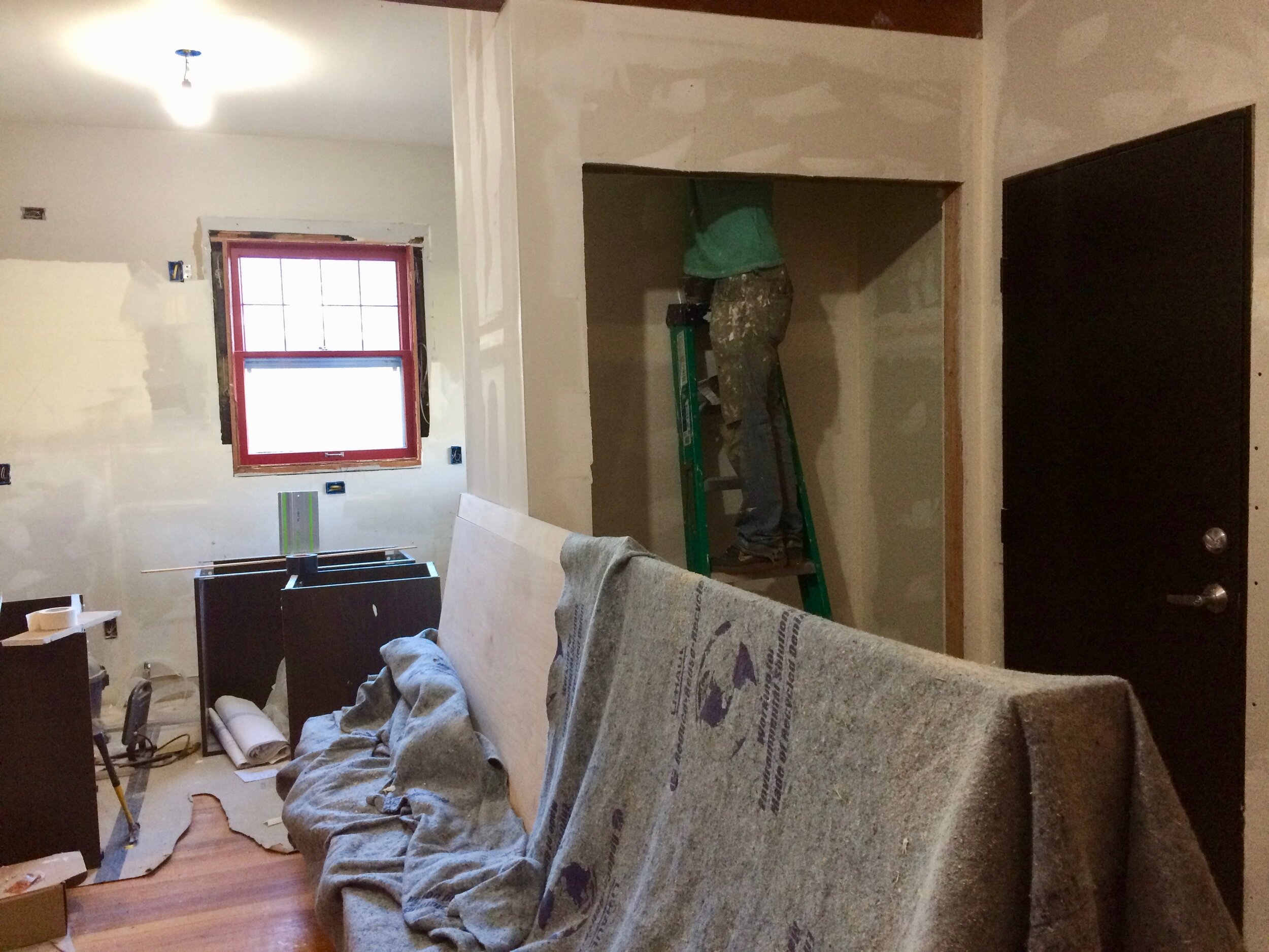
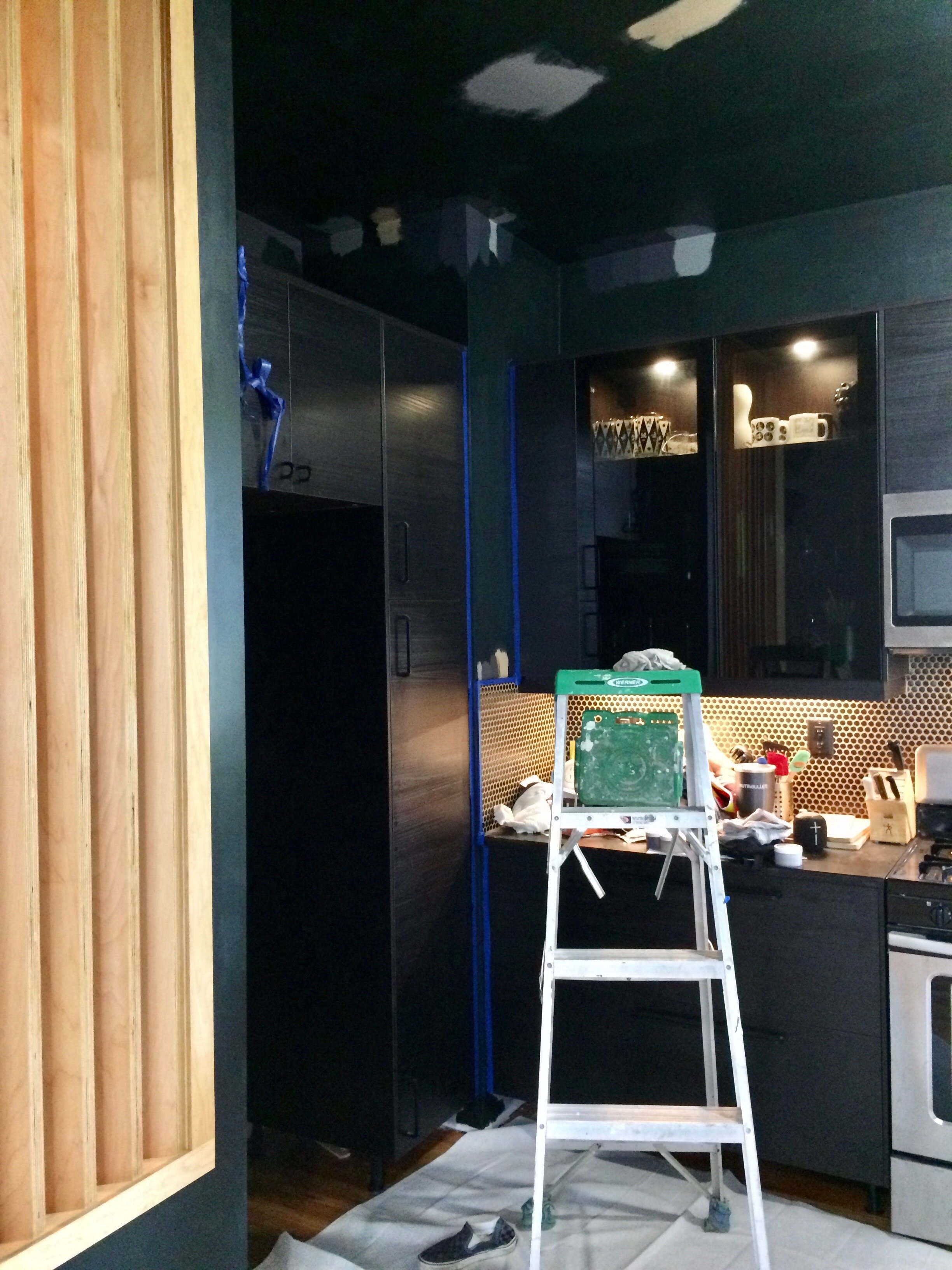
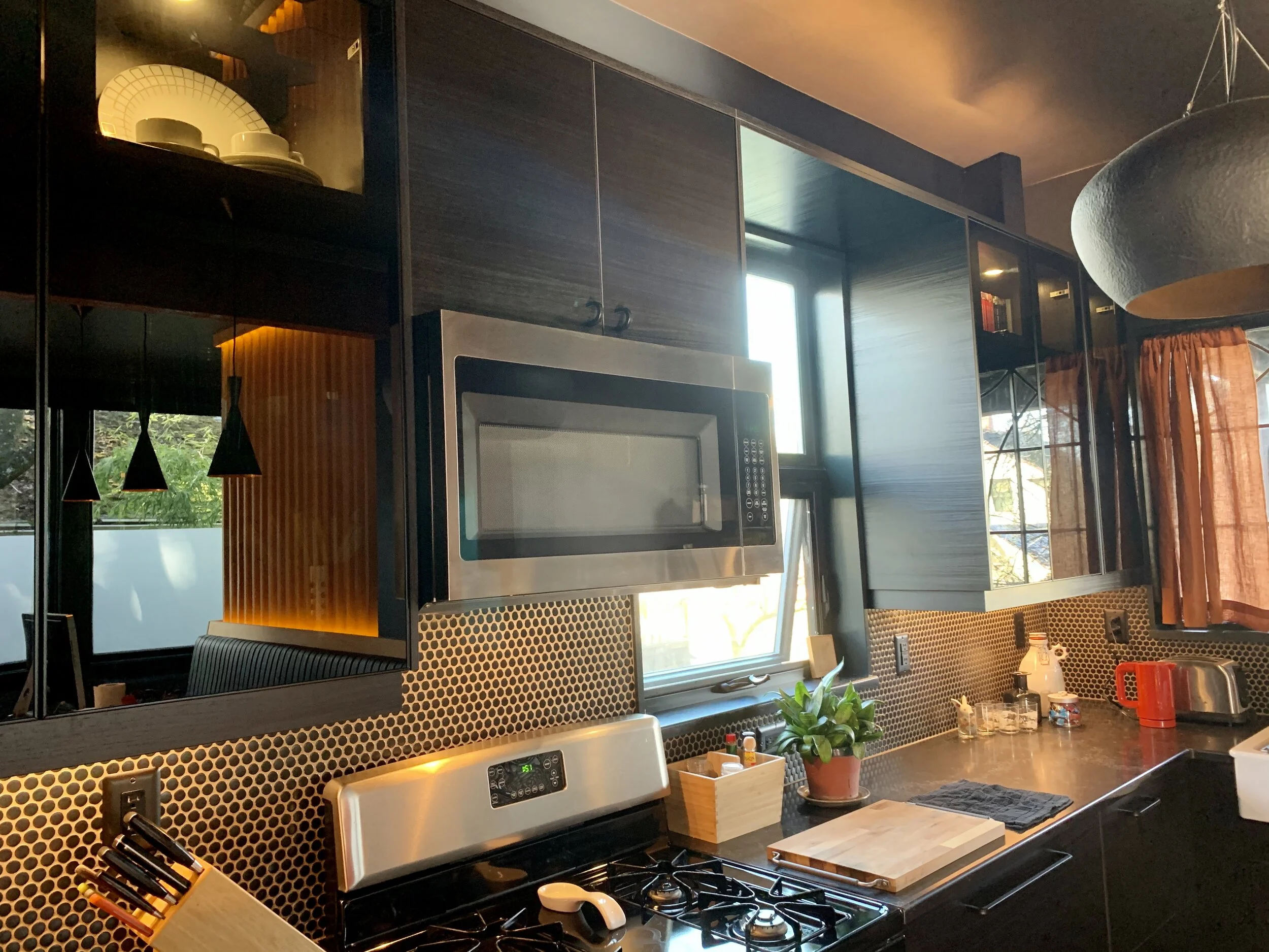
Tighten up the work zones! Replace broken stuff! Improve ergonomics! Integrate cooking and dining! The new kitchen is where our living room had been, at the front of the house facing the street rather than the side of our neighbor’s house. I became intimate with IKEA’s kitchen planner app and built it from their components. Lower cabinets are drawers, uppers are smoky glass. Instead of a soffit, the space above the uppers is lit with LED lights so that the ceiling seems to lift off.
STYLE INSPO:
Main inspo came from our existing dining room light: a black matte teardrop/drum pendant with hammered gold inside. Bold, smart, textured, mysterious, dynamic. The new kitchen color scheme just happens to complement our wedding china, an inspiration I didn’t even see until we were done. Now we have it on show! Also, shout-out to the Geoffrey Beene scarf my Dad gave my mom when I was a child: navy silk chiffon with gold metallic pinstripes that she wore on special occasions.


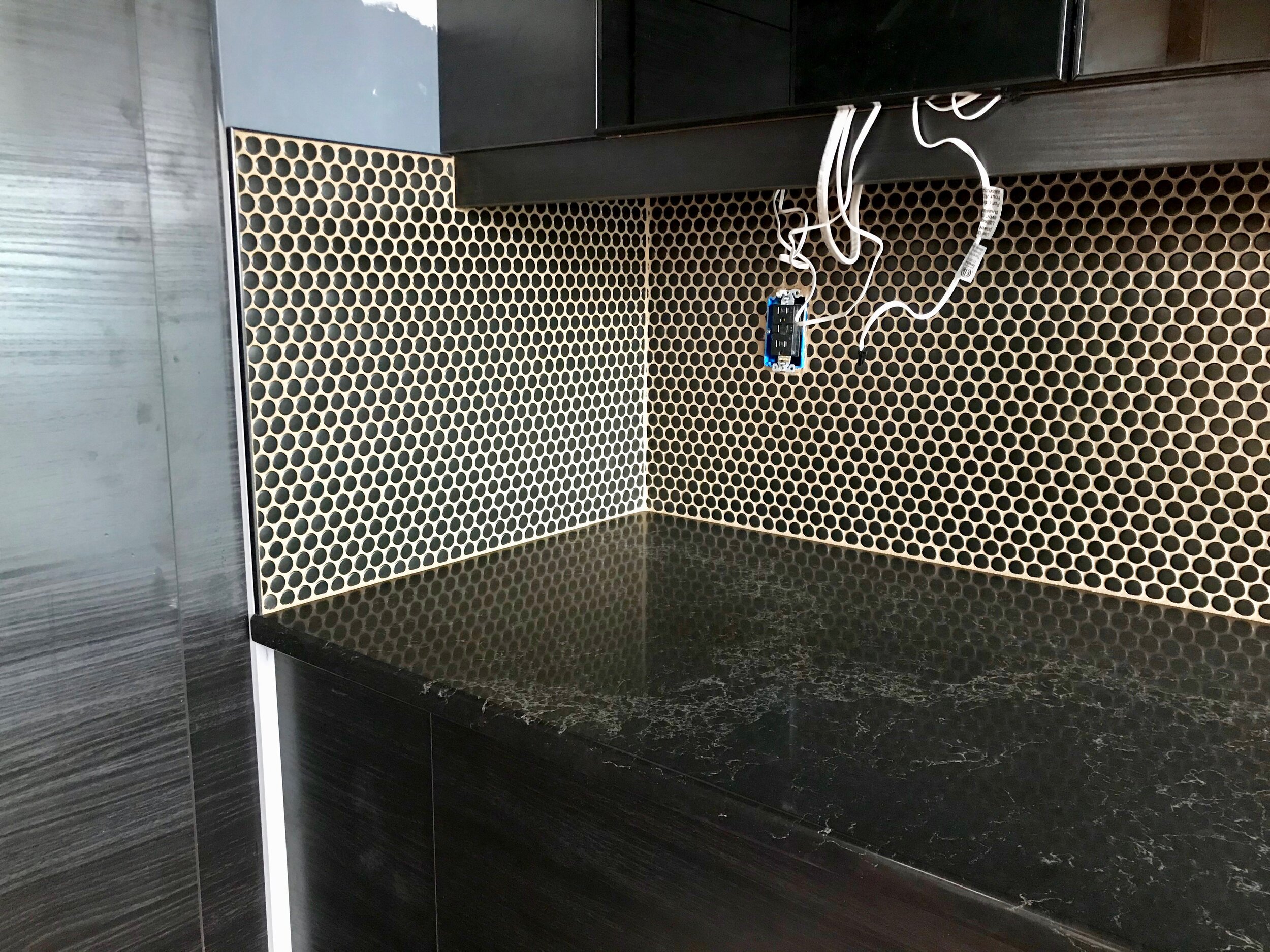
COUNTERTOPS:
Super durable quartz from Caesarstone (via IKEA). The veins have metallic bits that pick up all the other colors in here. It’s so freaking nice. The fella that came to verify measurements before fabrication used a cool ROBOT with lasers for accuracy.


TILE:
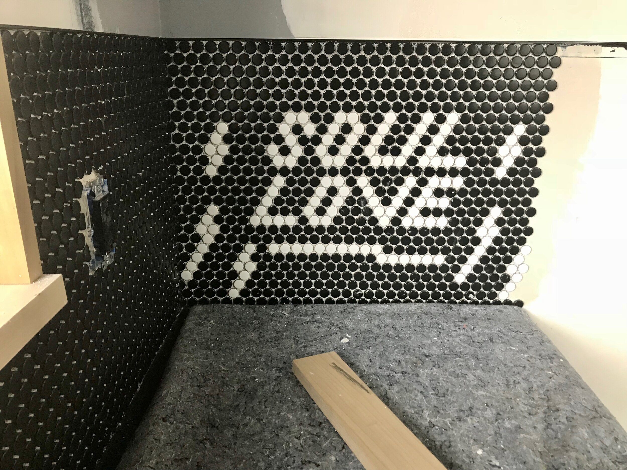
Black matte penny rounds with the gold metallic grout that we also used in the DISCO POWDER ROOM. Todd and I obsessively applied these sheets of tile so that the seams would disappear. I used a tile cutter to make all the partials. And, I couldn’t resist installing a message tucked around the corner by the coffee counter.


PAINT:
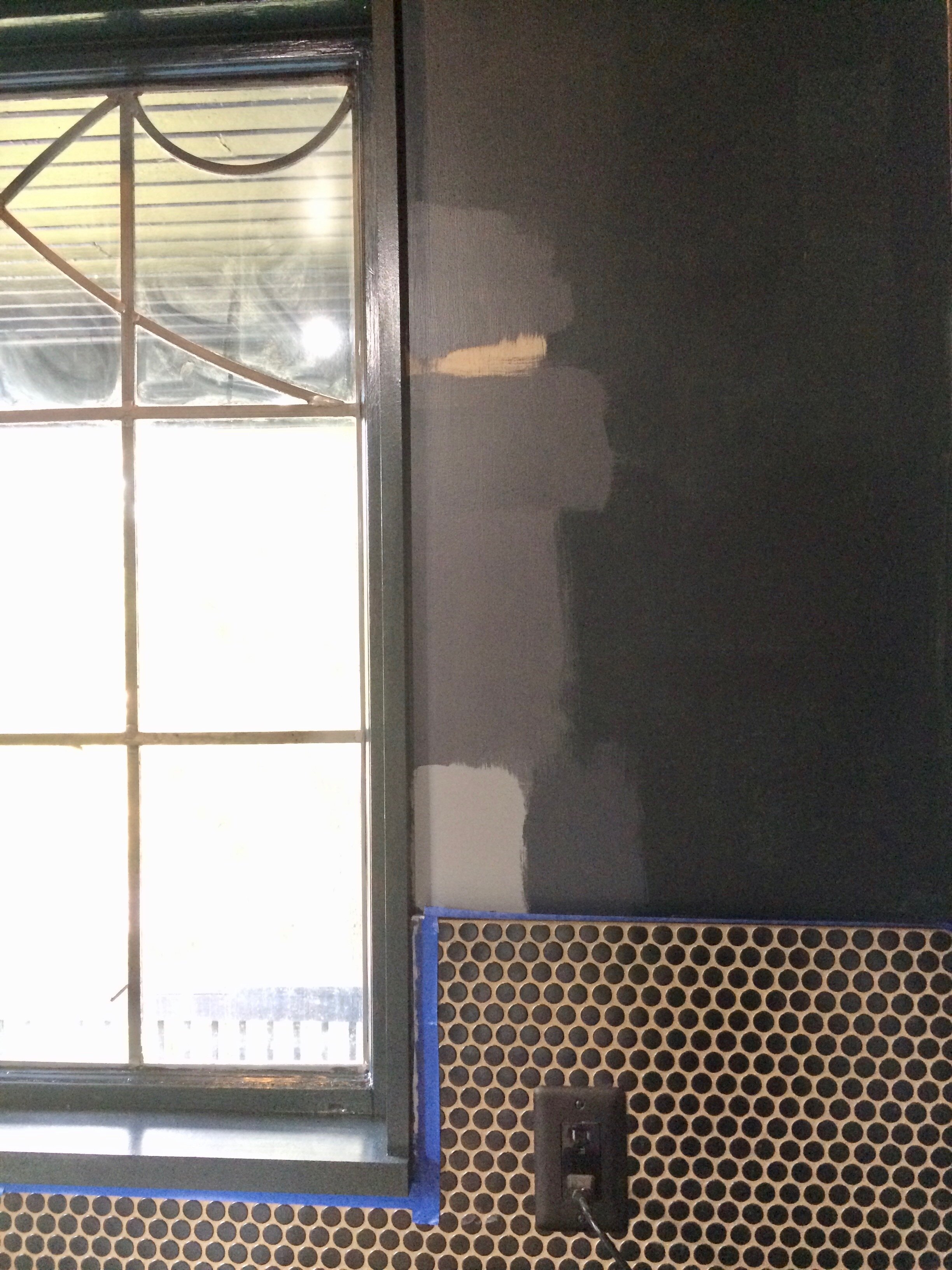
I painted every surface in the entire house. For the kitchen, I was deeply obsessed with using eggshell Black Knight by Benjamin Moore to match the window sashes (but those are semi-gloss, so there would still be some contrast). It’s got a touch of murky green in and it looks so bomb next to the banquette. However, once I had completed the first coat, feedback came in that it was TOO black, potential goth-chopping-accident black. No lighting had gone in yet, so yeah, it was dark. Logic won, and I finished the inside of the room in the lighter Black Horizon. It was the right choice.
AFTER
It’s difficult to quantify just how much this kitchen has improved our lives.


Next up: Exterior paint and evolving curb appeal…